Cerulean Blue – Origins, Historical Secrets, and Global Impact. Analyses by Guillaumette Duplaix, Editor of RUNWAY MAGAZINE. Photos: GettyImages / Pantone / Runway Magazine.
Elevated to the status of an icon by the film The Devil Wears Prada, Cerulean Blue conceals a history far richer than its Hollywood reputation.
Born from the science of pigments in the 19th century, it revolutionized Impressionist painting before becoming the secret weapon of the greatest couturiers.
Discover the secrets, the psychology, and the cultural subtleties of this fascinating celestial color.
Cerulean Blue: From the Palette of the Masters to the Fashion Runways.
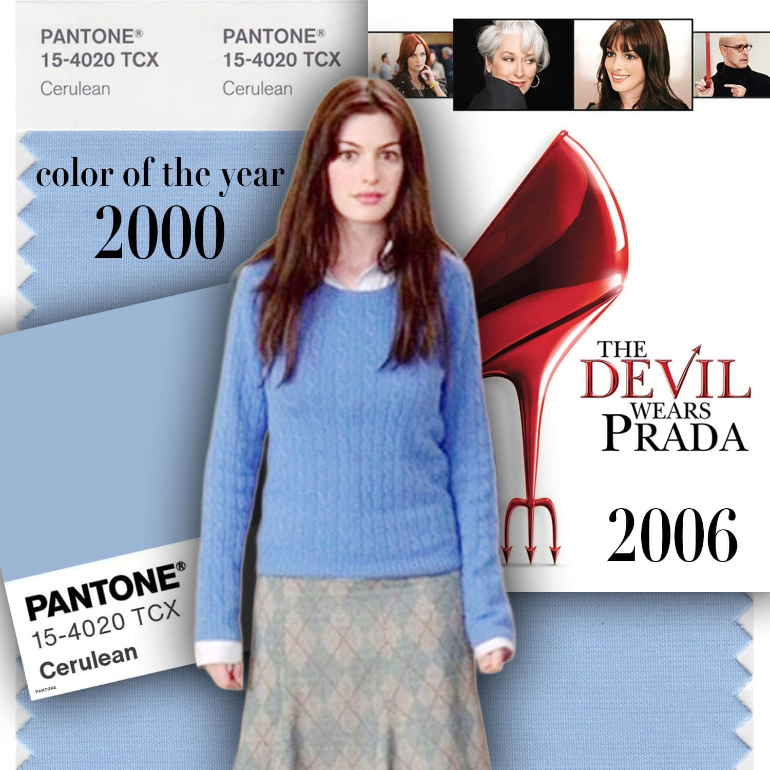
When Cerulean Blue is mentioned, the general public immediately thinks of the 2006 cult film, The Devil Wears Prada. In a memorable scene, the character of Miranda Priestly delivers a scathing monologue about a sweater of this color, demonstrating the invisible influence of Haute Couture on mass-market Ready-to-Wear:
“I see, you think this has nothing to do with you. You go to your closet and you select, I don’t know, that lumpy blue sweater, for instance, because you’re trying to tell the world that you take yourself too seriously to care about what you put on your back. But what you don’t know is that that sweater is not just blue, it’s not turquoise, it’s not lapis, it’s actually cerulean. And you’re also blithely unaware of the fact that in 2002, Oscar de la Renta did a collection of cerulean gowns… and then it filtered down through the department stores and then trickled on down into some tragic Casual Corner where you, no doubt, fished it out of some clearance bin. However, that blue represents countless jobs and millions of dollars and it’s sort of comical how you think that you’ve made a choice that exempts you from the fashion industry when, in fact, you’re wearing the sweater that was selected for you by the people in this room. From a pile of ‘stuff'” – Miranda Priestly.
The origin of this color choice in the film stems from here: Pantone announced its very first Color of the Year in 2000, and Cerulean Blue was chosen (even though The Devil Wears Prada was only released in 2006).
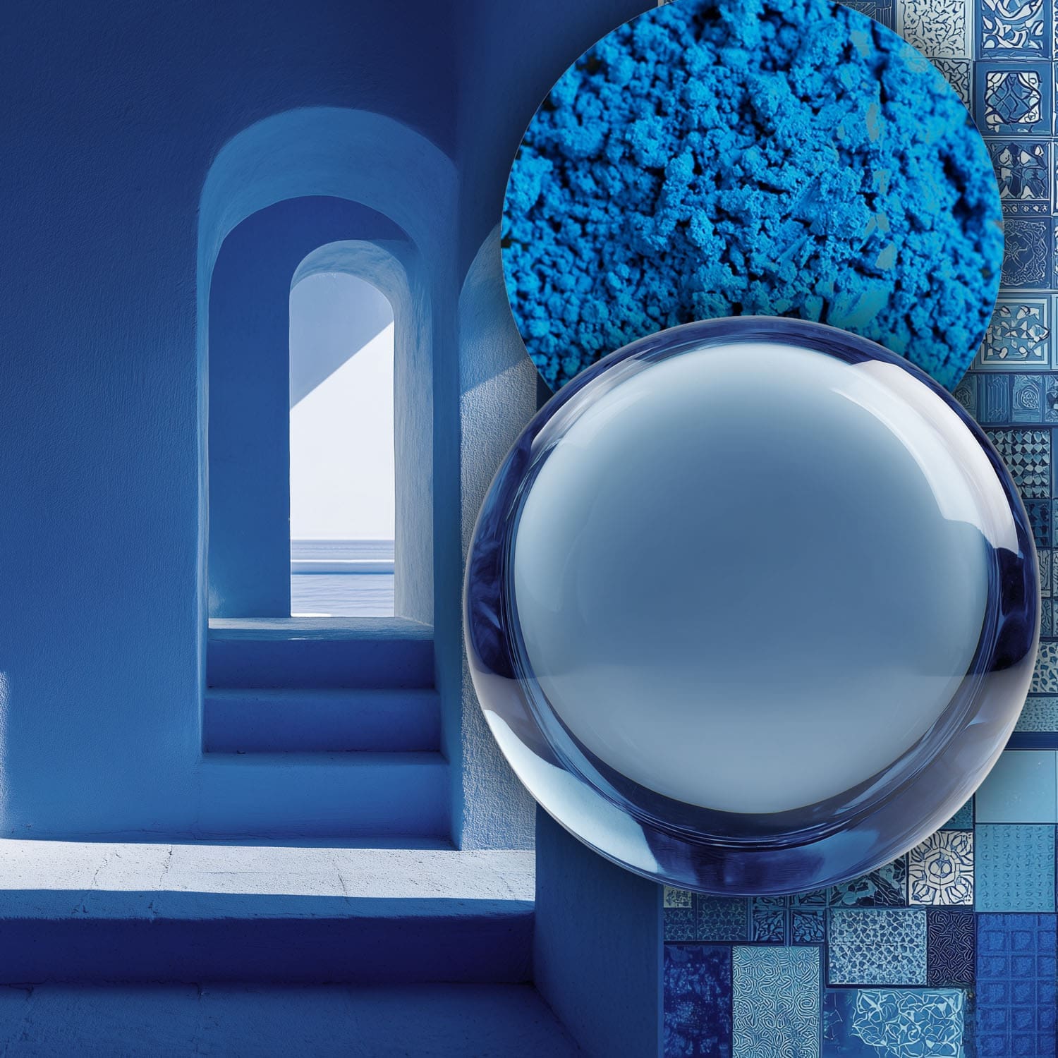
The word “Cerulean” draws its roots from the Latin caeruleus (dark blue) and caelum (the sky or heaven). Originally, coeruleum or ceruleum designated a pigment used in painting and decoration to capture the exact nuances of a pure sky and crystalline waters. Its strength lies in its stability: it is a permanent color that does not alter under artificial lighting.
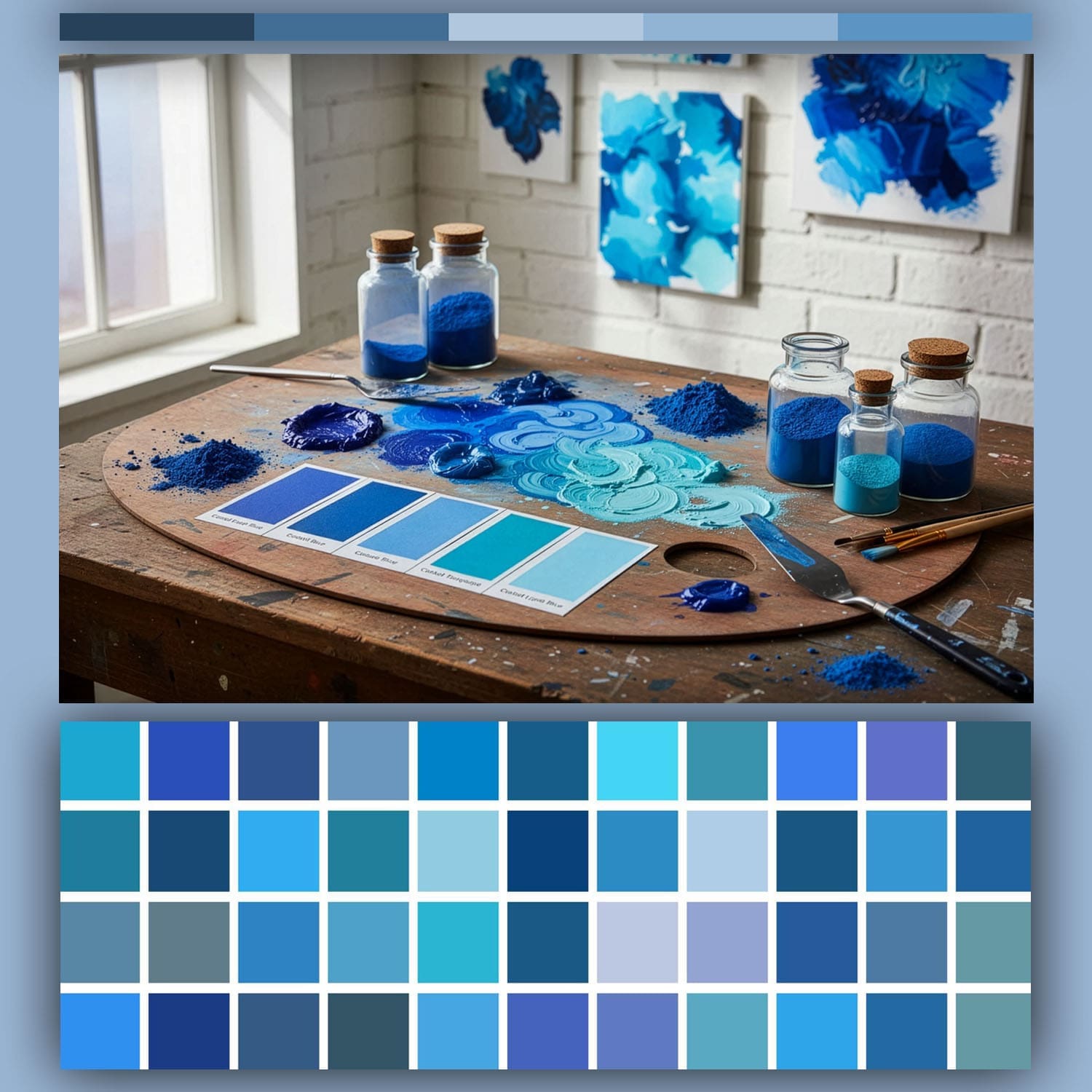
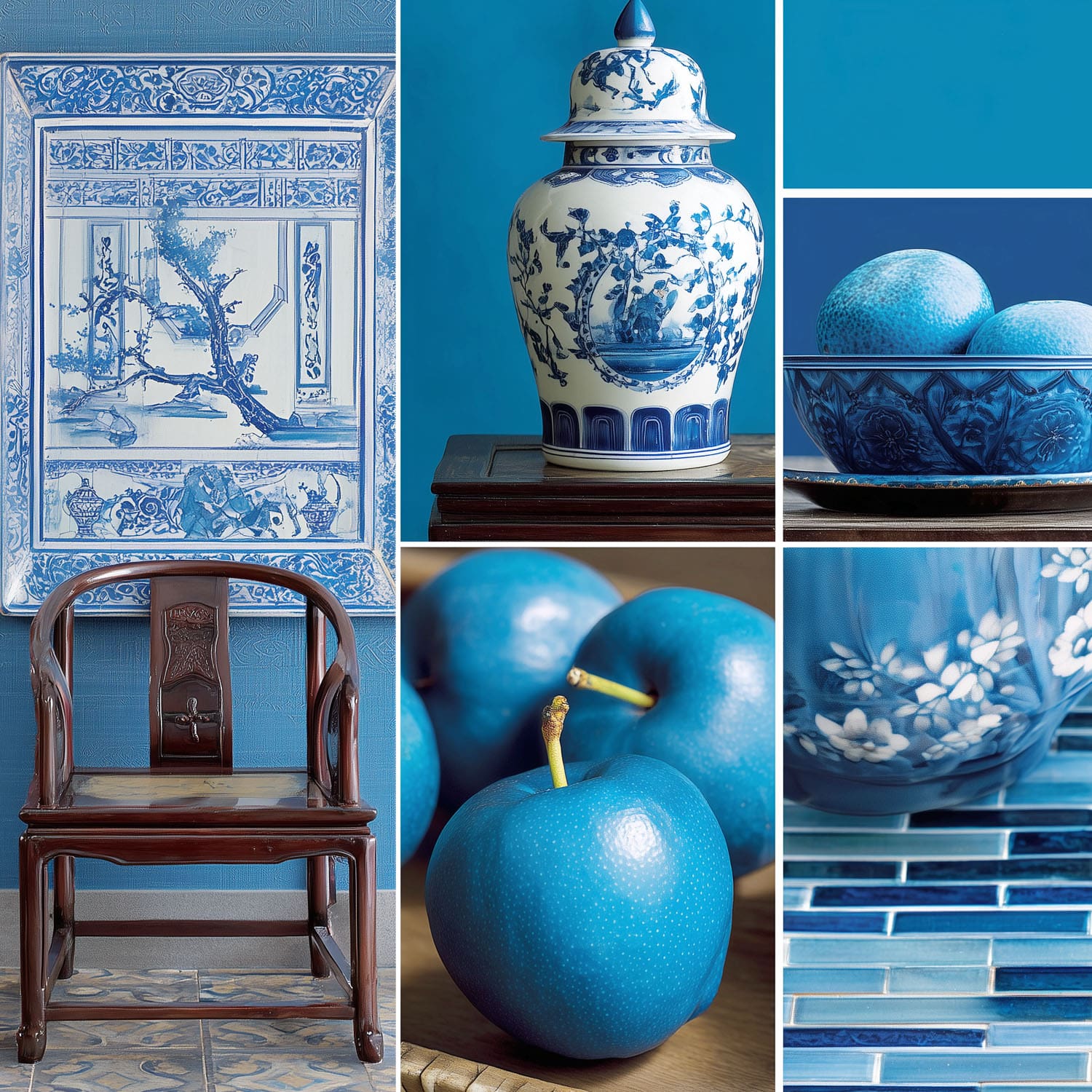
Cerulean Blue is a shade of blue that can range from a light azure blue to a more intense sky blue. It can also be blended with green. In comparison with turquoise blue, cerulean blue has a more pronounced, soft blue-green hue, whereas turquoise blue is generally more vivid and more green.
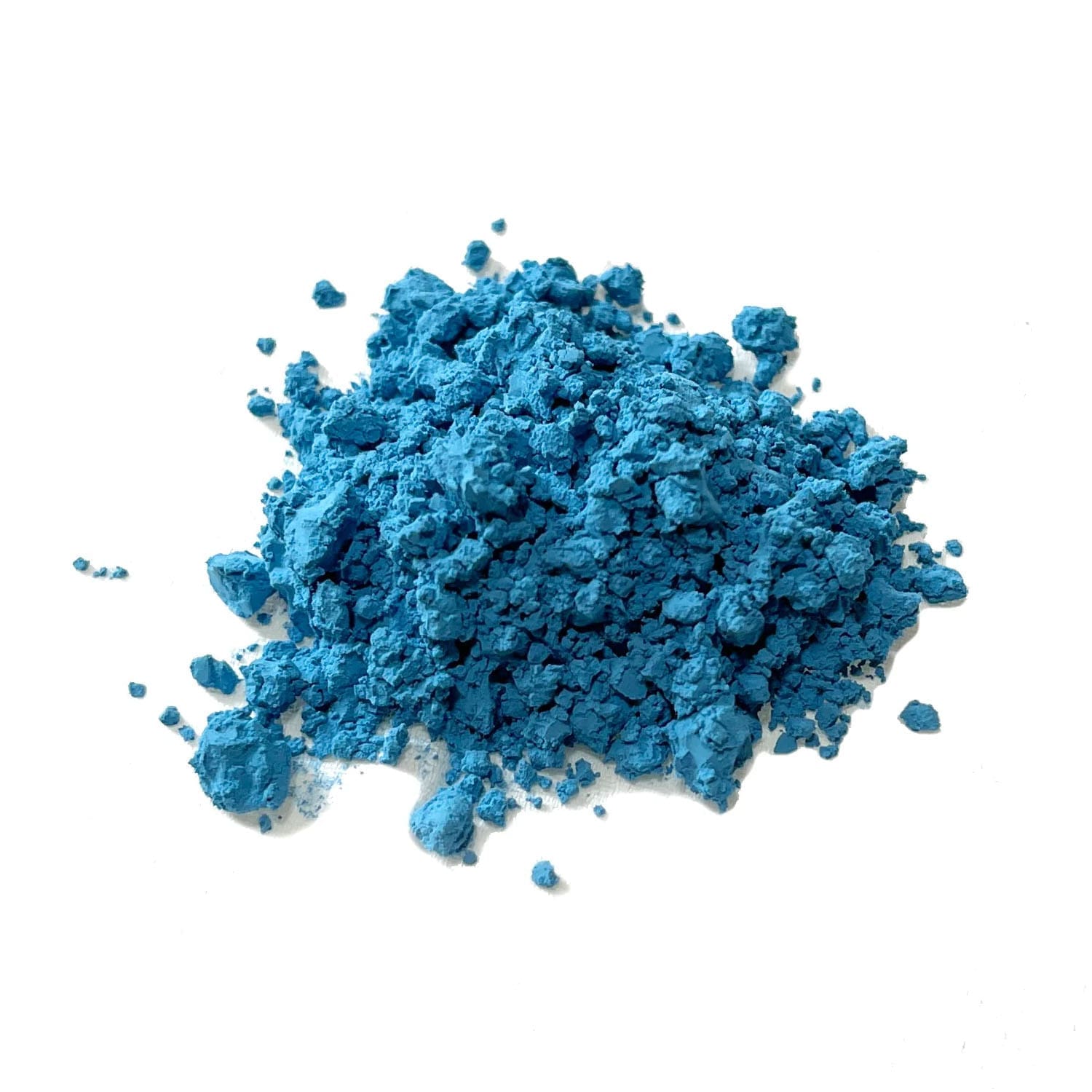
Reproduction of Cerulean Blue
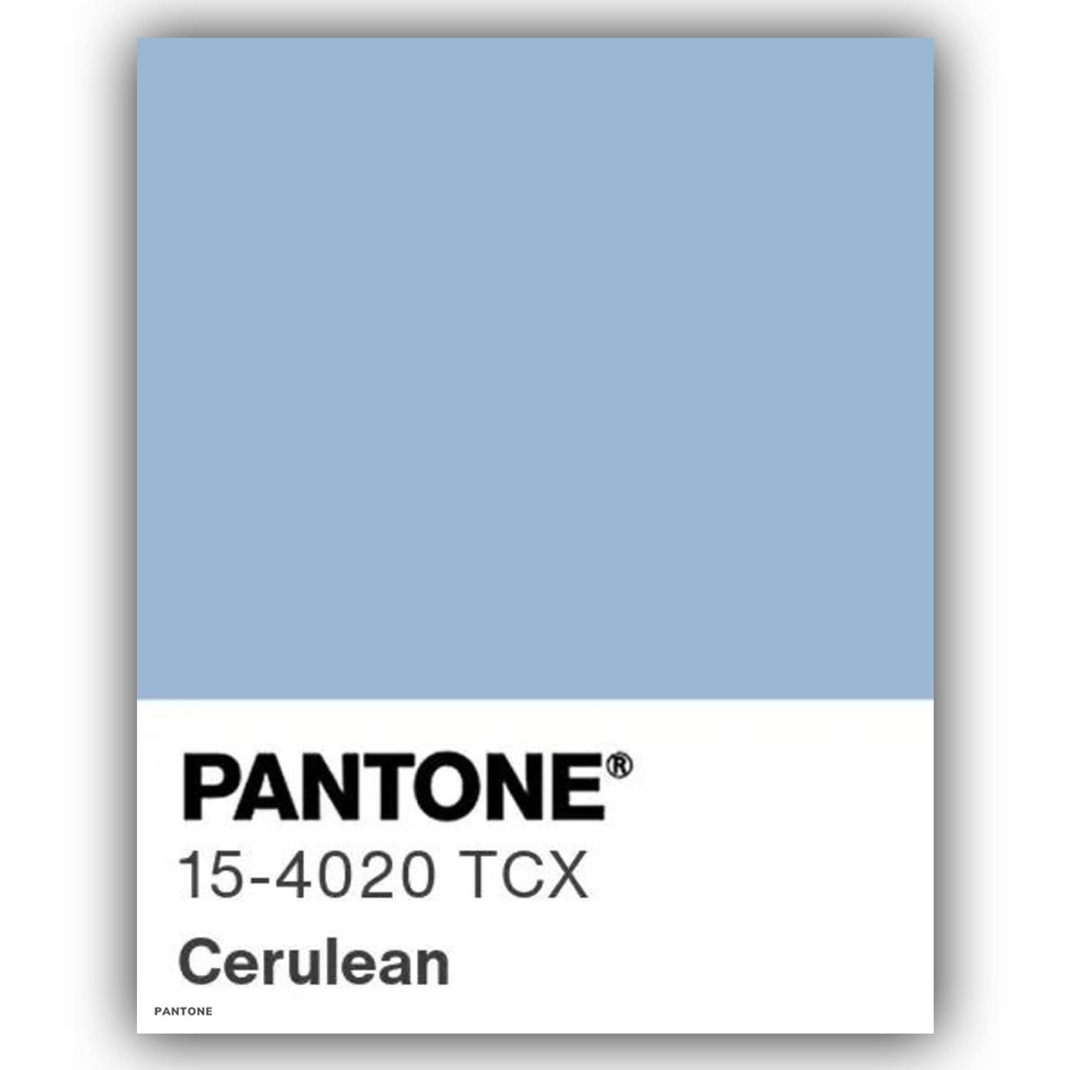
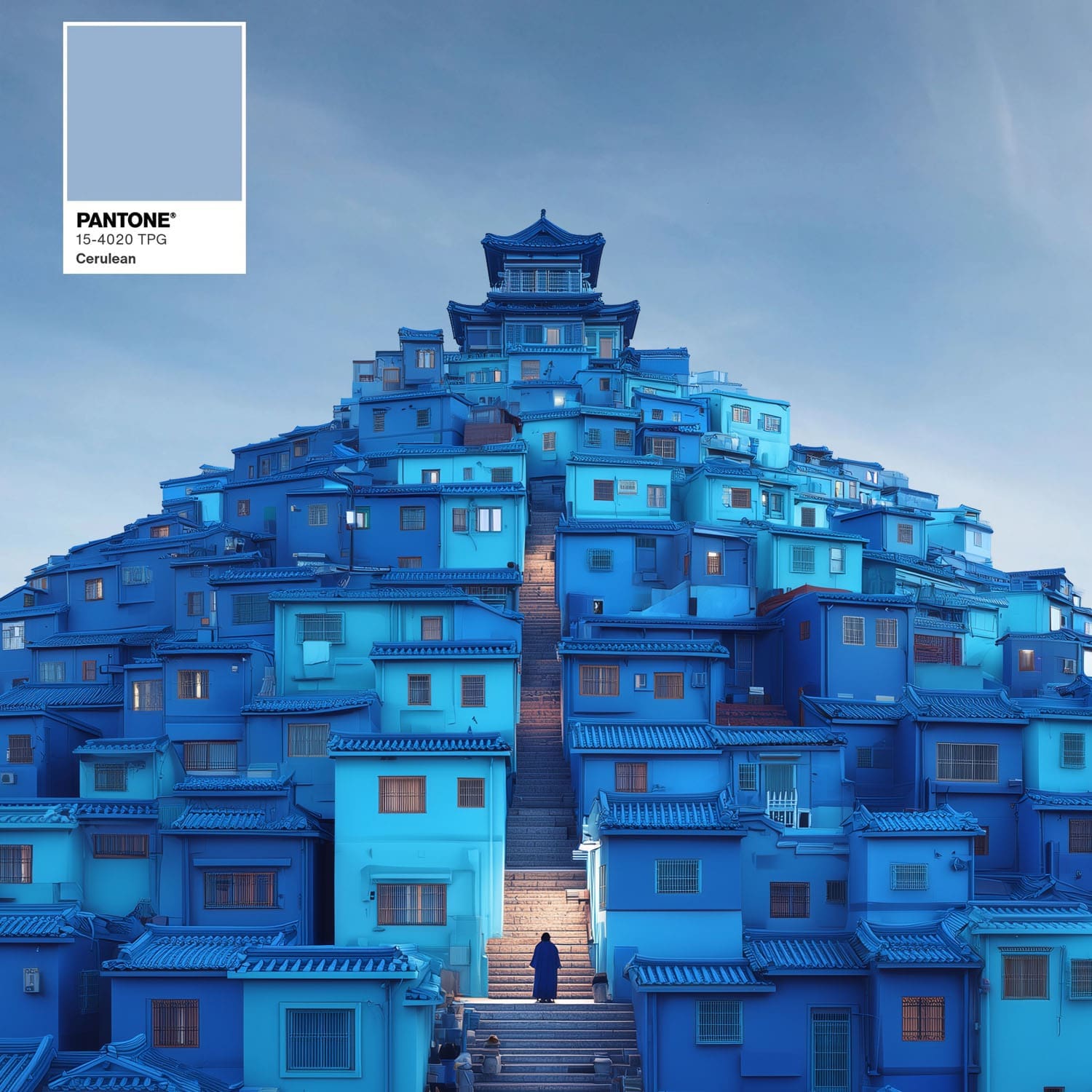
The official Pantone Cerulean Blue is PANTONE 15-4020 TCX (or TCX/TPX). This specific shade is a pale, calming sky blue often represented by hex code #98B4D4 or #9BB7D4, offering a serene, tranquil, and peaceful aesthetic.
Key Color Codes for Pantone Cerulean Blue (15-4020 TCX):
- Pantone Number: 15-4020 TCX (Textile Paper Extended)
- Hex Code: #98B4D4
- RGB: (152, 180, 212)
- CMYK: (37, 18, 0, 17) Approximate
Other Related Cerulean Definitions:
- Deep Cerulean: #007BA7
- Pantone 7690 C (Solid Coated): An alternative, darker cerulean shade
History of Cerulean Blue, a Precious Pigment
In the Middle Ages, the term coeruleum was used generally to describe the sky-blue pigments found in Latin manuscripts. At that time, cobalt and indigo were the primary sources for obtaining these shades. The modern history of “cerulean” began in the 19th century:
- 1802: The French chemist Louis Jacques Thénard discovered Cobalt Blue, drawing inspiration from Chinese porcelain.
- 1805: The Swiss chemist Albrecht Höpfner heated a mixture of cobalt and tin oxide. For decades, this process yielded a new shade called “Höpfner Blue” before some artists began calling it “cerulean,” though no specific pigment was truly associated with it yet.
Important Note: Cerulean Blue is a color creation and a paradox, as it is used in painting and decoration to capture the exact nuances of a pure sky and crystalline waters. However, depending on the medium (decoration, textile, pigment, etc.), the shade varies and is not as precise as natural colors. You will notice this with the visuals illustrating this article.
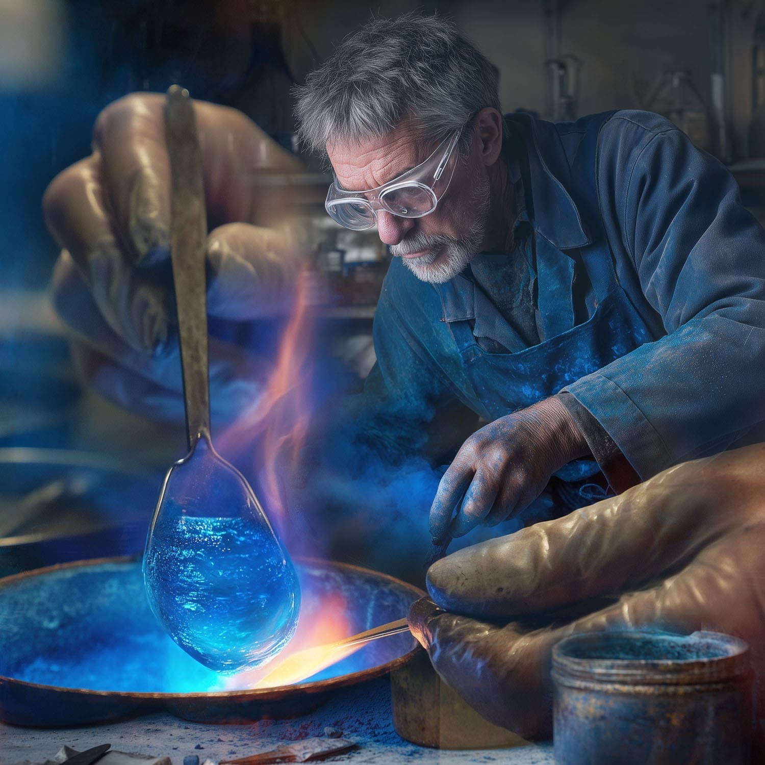
- 1860: After a 55-year wait, the English color merchant George Rowney finally commercialized the pigment under the official name of “coeruleum.” Despite its very high cost, which made it difficult to acquire, the popularity of this semi-transparent and luminous pigment grew continuously thanks to the unique freshness of its tones.
Cerulean Blue & Painters: The Exceptional Ally of the Impressionists
In the 1870s, Cerulean Blue became a central element in the palette of artists such as Claude Monet, Paul Signac, and Pablo Picasso. Marketed as synthetic paint in tubes, it proved extremely easy to transport, revolutionizing open-air painting (pleinairisme).
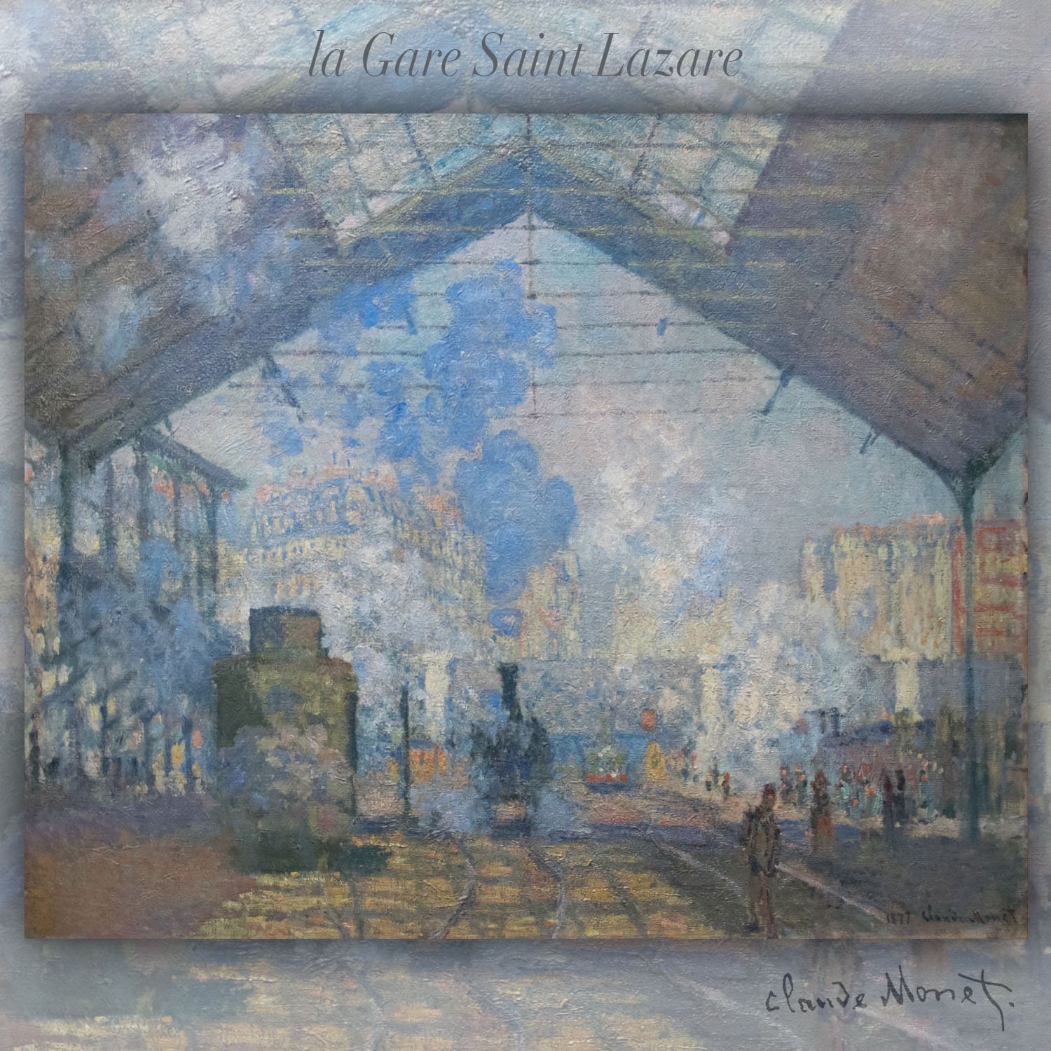
The most famous example of its use is found in Monet’s masterpiece, La Gare Saint-Lazare (1877). Here, the artist uses billows of steam in a brilliant Cerulean Blue to structure a hazy industrial scene, paradoxically bringing to it a vibrant clarity and luminosity. Because Cerulean Blue was a synthetic paint in tubes, it was easy to transport for painting outdoors. Cerulean Blue became a vibrant addition to the palettes of 19th-century artists.
Cerulean Blue (along with cobalt blue, synthetic ultramarine, and other brilliant colors) integrated into a new palette rapidly adopted by artists of the era, who were eager to breathe life and dynamism into their canvases. The painter Jehan Georges Vibert described these intense pigments as “dazzling,” while the Impressionist Pissarro stated that he had banished the old, dull, and uniform “earthy” colors from his palette.
Cerulean Blue is widely considered the perfect sky-blue color. A semi-transparent, pure, and luminous pigment with green undertones, it reacts neither to light nor to chemicals, making it a permanent and precious addition to the artist’s palette.
Conversely, Cerulean Blue remained inaccessible to artists for more than fifty years; its price was high. Despite these obstacles, its popularity never ceased to grow, notably thanks to its cool blue tones.
The Subtle Power of the Modern Era
Even today, Cerulean Blue remains a premium, high-end pigment. While it appears intense on the palette, its tinting strength decreases significantly when blended with other shades. It is precisely this low tinting intensity that constitutes its strength: it allows artists and portrait painters to create atmospheric effects of immense subtlety.
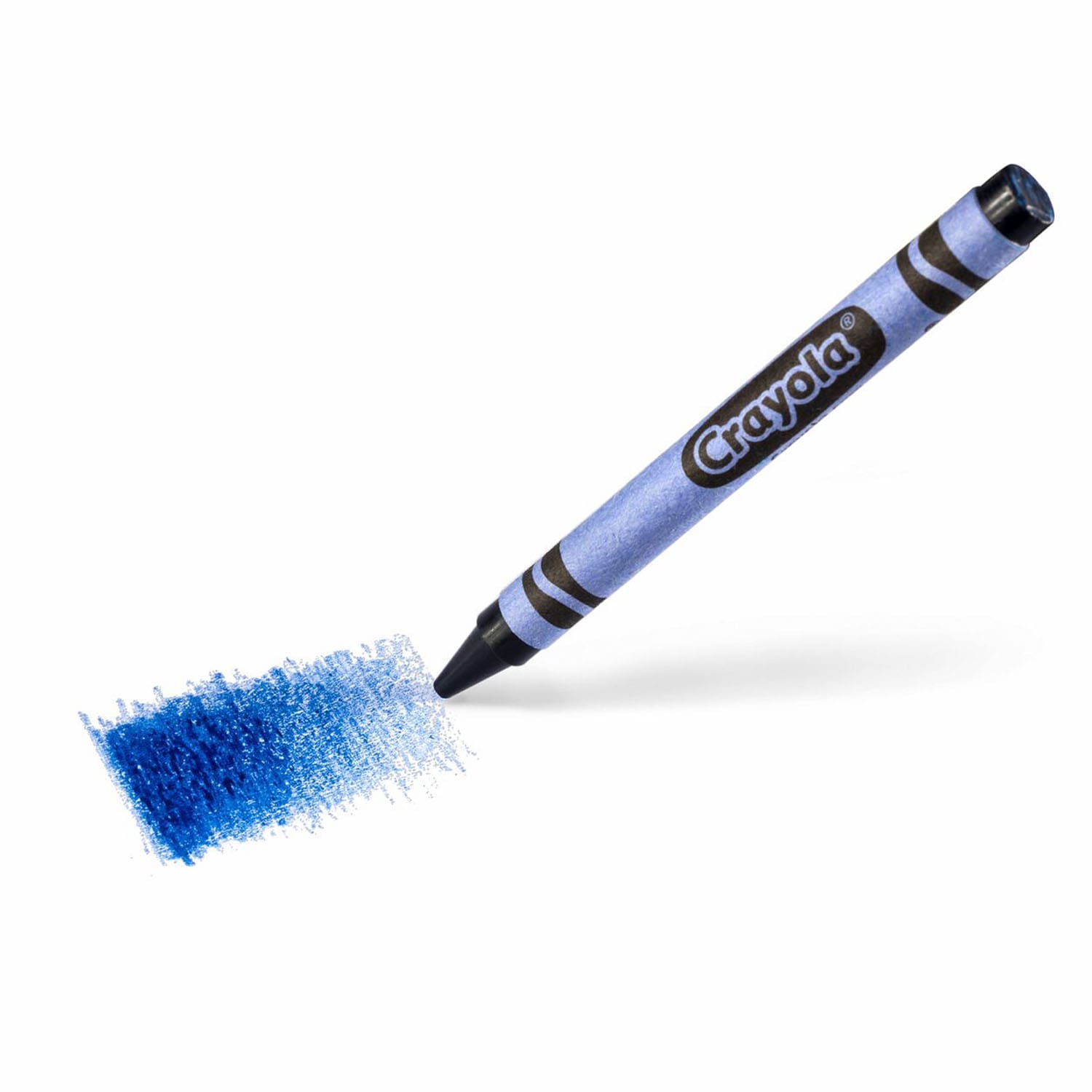
Popular culture has also embraced it at every scale. In 1949, the Crayola brand integrated a cerulean blue crayon into its standard box for the first time, before offering a version in 1990 that was even more faithful to the original pigment.
From the Palette to Haute Couture
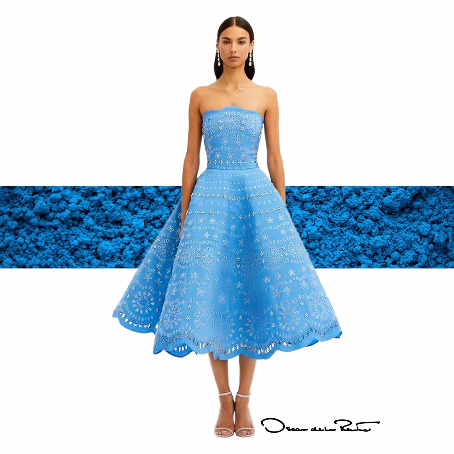
The impact of Cerulean Blue on fashion extends far beyond the monologue from The Devil Wears Prada, a line widely seized upon by a massive product marketing operation of every kind following the film, extending all the way into 2026 until eyes were completely exhausted. Historically, Pantone had moreover officialized this cultural importance by choosing Cerulean Blue as its very first “Color of the Year” in the year 2000.
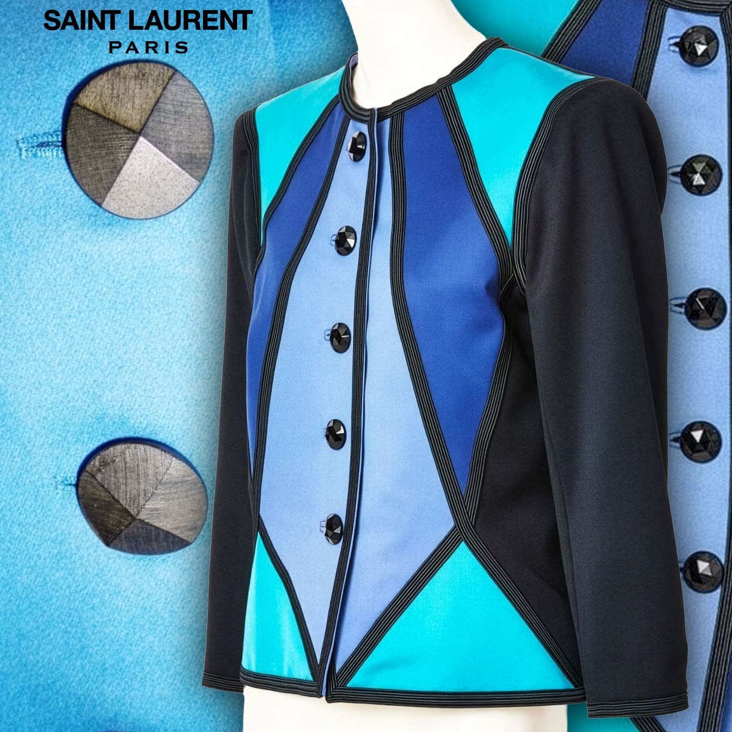
In fashion history, the great couturiers have masterfully exploited its symbolic power. Yves Saint Laurent, deeply influenced by his stays in Marrakech beginning in 1966, integrated this luminous shade directly into the heart of his collections. The famous Cerulean Blue military jacket was born from his Moroccan travels. By subverting masculine dress codes (pea coats, trench coats, tuxedos, and the famous 1967 saharienne safari jacket), Saint Laurent offered women a bold and powerful allure, magnified by the clarity of this unique blue.
Psychological Impact of Cerulean Blue in Fashion Marketing
1. The Psychology of Color: Serenity and Reliability
- Immediate calming effect: Directly associated with clear skies and the ocean, Cerulean Blue triggers a sensation of calm, reducing visual stress for the consumer.
- Sense of trust: In marketing, blue is the color of security and fidelity. Cerulean Blue conveys an image of integrity and professionalism for a fashion brand.
- Positive universality: It is a transactional hue that suffers from no major negative connotations, facilitating acceptance by a global and diverse audience.
2. Marketing Positioning: The Balance Between Luxury and Accessibility
- Elite and distinction: Due to its history linked to costly art pigments and Haute Couture (YSL, Oscar de la Renta), it instantly evokes exclusivity and refinement.
- Refreshing modernity: Unlike navy blue (highly traditional/corporate) or royal blue (highly saturated), Cerulean Blue brings a luminous clarity that modernizes a brand’s image.
- The “Trickle-Down Effect”: Popularized by pop culture, it symbolizes the transition from an elite concept to a mass desire, allowing Ready-to-Wear brands to sell an “accessible dream.”
3. The Impact on Purchasing Behavior
- Deliberate and value-driven purchasing: Cerulean Blue is not an aggressive impulse color (like red). It invites a value-driven purchase, associated with the quality and durability of the garment.
- Stimulation of creativity: Its touch of green stimulates the intellect and stylistic audacity, prompting the customer to dare a differentiating color that is nonetheless deemed “safe” to wear.
- Visual memorization: Its unique clarity makes it an excellent choice for visual merchandising (window displays) or packaging, capturing the gaze without offending the eye.
Blue does not possess the positive universality attributed to it in the West
Here is how the perception of blue (including light shades like Cerulean Blue) transforms in the East:
1. The connection with mourning and the supernatural
- South Korea: Contrary to the West where black dominates, blue is traditionally the color of mourning. A fashion campaign entirely based on variations of blue can be perceived there as austere, or even ominous.
- China: In traditional Chinese culture, blue (particularly dark or dull blue) is historically associated with ghosts and death. It is considered a cold color, linked to Yin energy (passive, dark), as opposed to red, which represents Yang (vibrant, lucky).
2. The dilemma of social status and accessibility
- Imperial China: While yellow and red were reserved for the elites and the emperor, blue (obtained from indigo dye) was the color accessible to everyone. This association extended into the 20th century with the blue uniforms of workers and peasants under the communist regime. In Asian luxury marketing, blue can thus lack that perception of “high status” or exclusivity that it possesses in Europe.
3. A purely spiritual and sacred dimension
- India (Hinduism): Blue carries a very positive connotation, but it is strictly divine and religious. It is associated with the infinite and with deities like Krishna (frequently depicted with blue skin). Utilizing this color for purely commercial or lighthearted purposes in fashion can sometimes border on a lack of respect if it is poorly contextualized.
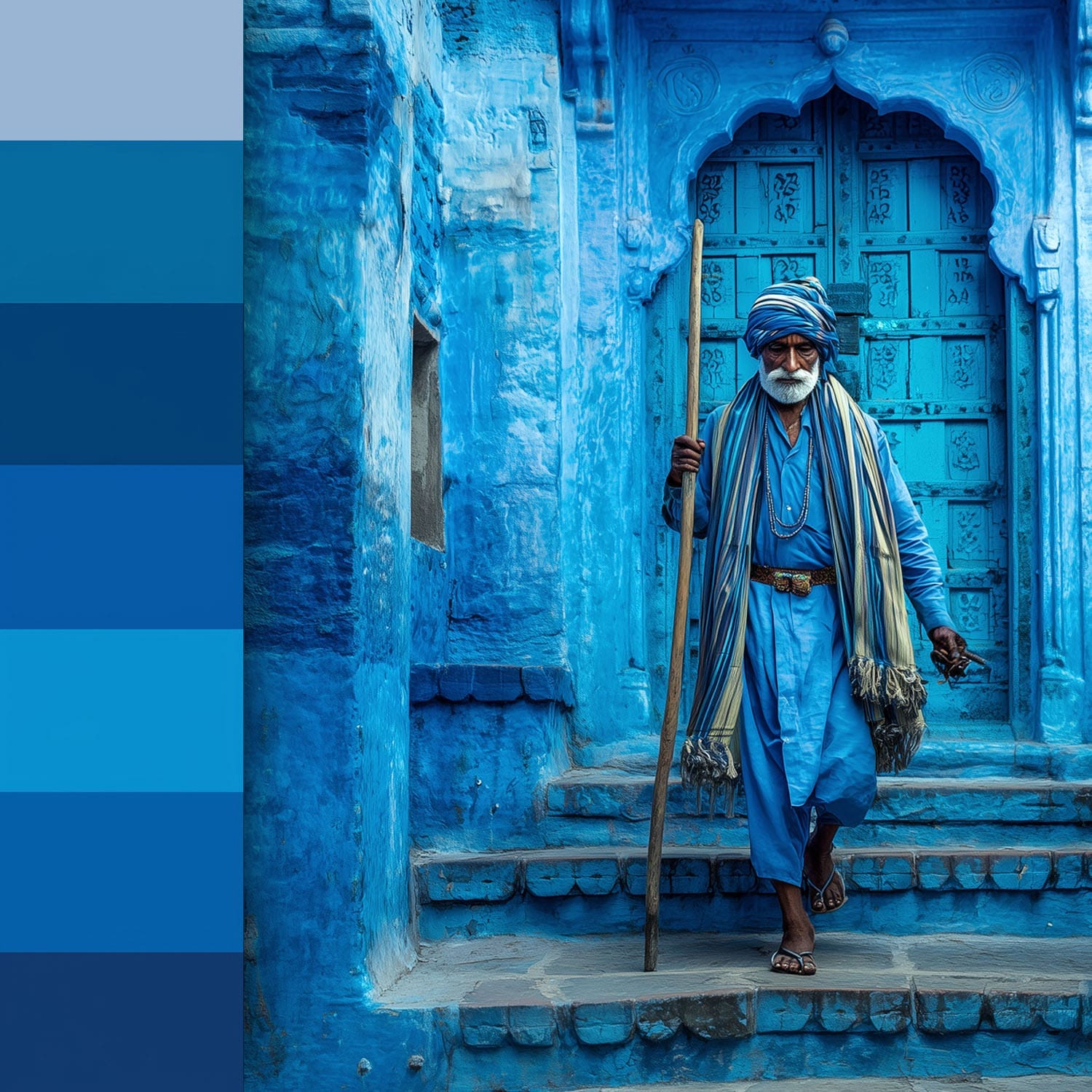
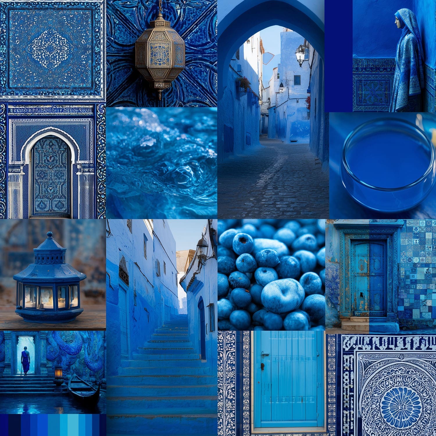
- Middle East: Here, blue is primarily a color of protection. It symbolizes the sky and spirituality, serving as a shield against the evil eye (such as the famous Nazar Boncuk talisman). It is perceived less as a “fashion” trend and more as an attribute of preservation or faith.
The Impact on Fashion Marketing
For an international brand, commercializing a “Cerulean Blue” collection requires adaptation:
- In the West: The focus will be on emphasizing serenity, modern elegance, and references to Haute Couture.
- In the East: A total-blue look will be avoided to prevent associations with mourning, and it must imperatively be paired with touches of gold, red, or white to elevate its perceived value and neutralize its cultural “coldness.”
Cerulean Blue Through the Prism of Cultures: The East-West Clash
While Cerulean Blue immediately evokes serenity and luxury in the West, its integration into international fashion marketing demands great caution. The perception of colors is not universal, and this celestial shade shifts meanings radically depending on the targeted geographical zone.
- In the West (Europe and the Americas): Blue is the consensual color par excellence, widely acclaimed as the favorite shade of the majority of the population. Cerulean Blue embodies peace, integrity, high technology, and refinement. Brands utilize it to inspire absolute trust and timeless elegance.
- In East Asia (China and Korea): The symbolism shifts. In South Korea, blue is traditionally the color of mourning. In China, blue shades are historically associated with otherworldly forces and melancholy. Furthermore, indigo was long the color of the working-class people’s attire. A total Cerulean Blue look can thus lack the status-driven and exclusive dimension indispensable to luxury.
- In India and the Middle East: Blue takes on a highly sacred and spiritual dimension. Linked to major deities in Hinduism or utilized as a traditional shield against the evil eye in the Middle East, it transcends the framework of a simple stylistic trend to touch upon the realms of faith and protection.
To succeed in its deployment across Eastern markets, a global brand cannot transpose its Western codes exactly as they are. It must ensure that Cerulean Blue is paired with warm or imperial shades, such as gold or white, in order to neutralize its cultural coldness and elevate its perceived value.
General Conclusion
At the end of the Middle Ages, the hierarchy of colors was organized to place blue at the absolute summit—a symbol of royalty, peace, and nobility. Cerulean Blue aligned itself perfectly within this heritage.
Whether used to paint the skies of an Impressionist canvas, to color the iconic pieces of great couturiers, or to inspire contemporary marketing trends, this pigment has transcended the centuries to establish itself as the perfect shade of “Celestial Blue.”
The history of Cerulean Blue demonstrates that a color is far more than a simple wavelength or a chemical formula. Born from the 19th-century scientific quest of chemists to offer painters a permanent sky, this semi-transparent pigment first conquered the luminous palette of the Impressionists before imposing itself, decades later, on the runways of global Haute Couture.
From the Moroccan audacity of Yves Saint Laurent to the sharp monologues of contemporary cinema, Cerulean Blue has established itself as a vector of power and stylistic metamorphosis. Yet, its journey across the globe reminds us that fashion remains inseparable from culture. What is perceived as a celestial and soothing breath of fresh air in Paris or New York can resonate quite differently in Seoul or Shanghai.
Ultimately, Cerulean Blue remains a shade of exceptional richness. Mastering its history, its technique, and its geographical subtleties allows it to be used no longer as a mere aesthetic cliché, but as a true tool of visual storytelling and brand strategy.
Clichés, precisely! They provide an informational starting point, but it is perhaps more interesting to pursue one’s curiosity by discovering its origin—how it “landed” in a fashion film where the screenwriter simply “plucked” it from Pantone, the color specialist that had announced Cerulean Blue as the Color of the Year six years earlier.
