
Optic Color in Fashion. Color Analyses by Guillaumette Duplaix, Executive Editor of RUNWAY MAGAZINE.
Fashion has always been an exercise in manipulation, but nothing plays with human perception quite like the calculated hysteria of optic color. We are no longer merely discussing the quiet elegance of a shade; we are talking about colors engineered to assault the retina and command the room.
From the blinding clarity of optic white to the vibrating frequencies of neon overlays, these tones do not wait to be noticed—they demand a reaction. In a world saturated by digital noise, designers are increasingly weaponizing the physics of light, turning garments into visual illusions that blur the line between fabric and frequency.
Let’s dissect how high fashion stopped playing nice with the color wheel and started hacking our optical nerves.
Part I: The Physics of the Visual Illusion
Before this phenomenon ever hits a runway or a textile mill, it exists as a strict consequence of light waves and biological machinery. True optic color—or structural color—does not rely on traditional pigments that absorb specific wavelengths and reflect others. Instead, it is an architectural trick of physics.
When light hits a microstructured surface, the physical interference of the waves causes certain frequencies to amplify dramatically while canceling others out completely. It is the same mechanism that gives a butterfly’s wing or a peacock feather its iridescent, metallic hum—surfaces entirely devoid of actual blue or green pigment, yet blindingly vibrant to the human eye.
In the laboratory, creating these effects requires manipulating the light spectrum itself:
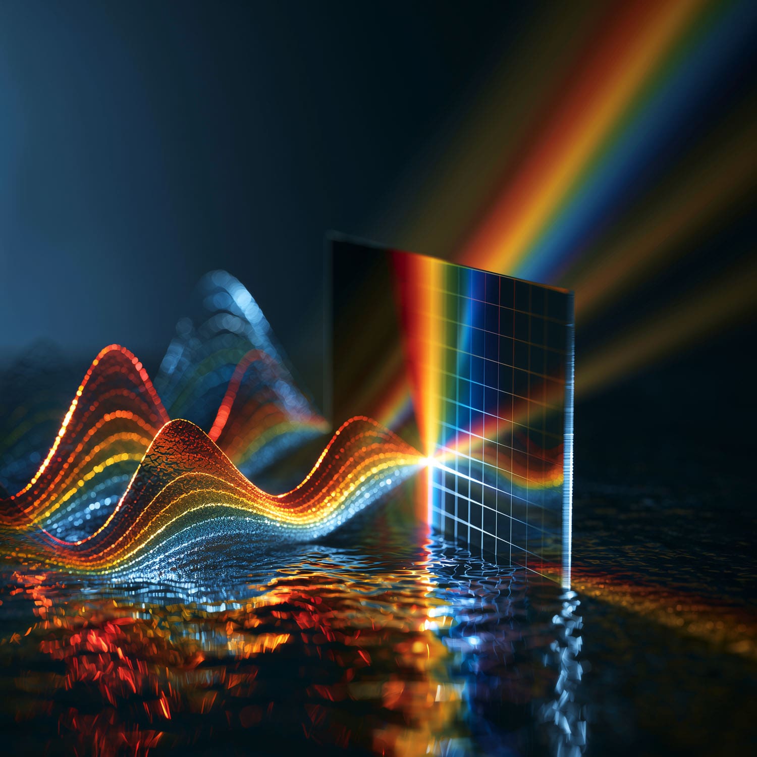
- Additive vs. Subtractive Light: While traditional design relies on subtractive color (mixing dyes that absorb light), optic colors frequently mimic the additive properties of digital screens (RGB), tricking the brain into perceiving a luminance that the physical fabric shouldn’t technically possess.
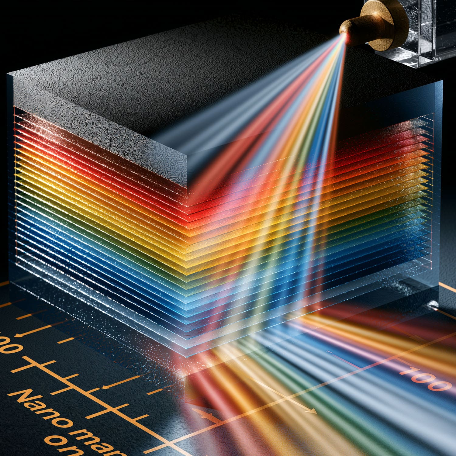
- The Flashing Phenomenon: By layering materials at microscopic intervals that match the nanometer wavelengths of visible light (roughly 400 to 700 nanometers), scientists can force light into “constructive interference,” reflecting a hue with up to four times the intensity of standard chemical pigmentation.
It is a world governed by refraction, wave frequencies, and the limitations of human rods and cones. And naturally, because it is brilliant, volatile, and deeply disruptive, fashion instantly wanted to wear it.
Part II: The Runway as a Particle Accelerator
Once you strip the physics of its equations, you are left with the ultimate vanity project: fashioning light itself. When designers realized they could move past flat, stagnant chemical dyes and begin staging actual visual warfare on the human retina, the runway transformed overnight. This isn’t a new obsession, but rather the perfection of an old one. In the 1960s, space-age pioneers like Pierre Cardin and André Courrèges played with the illusion of optics, using sharp geometric patterns and blinding vinyl whites to mimic a futuristic aesthetic. Today, however, the industry has graduated from mere illusion to genuine material science. By embedding microscopic, light-refracting structures directly into synthetic fibers, contemporary houses are creating garments that literally shift shades based on the angle of the viewer.
The application of this science on the runway manifests in three distinct ways:
- Luminous Kineticism: Fabrics that do not merely reflect the ambient lighting of a salon, but amplify it. Under high-intensity show lights, these materials experience constructive interference in real-time, making a silhouette appear to expand, contract, or vibrate as the model moves.
- The Digital Screen Hijack: Luxury brands are fully aware that more people view their collections through an OLED mobile screen than from a front-row seat in Paris. Optic colors are engineered to survive—and dominate—the compression algorithms of digital media, retaining an aggressive, glowing saturation that standard textiles lose entirely online.
- Chromatographic Illusions: Moving beyond simple iridescence, modern haute couture utilizes multi-layered polymers to create structural gradients. A jacket can transition from a deep, light-absorbing obsidian to a piercing, laser-like emerald simply through the sway of a step.
Ultimately, fashion’s adoption of optical science proves that the industry is no longer satisfied with dressing the body. It wants to control the very air, light, and space surrounding it.
OPTIC COLOR
Optical color is a visual sensation governed by our personal unconscious.
The primary colors corresponding to the mechanism of vision revolve around three
centers:
Short wavelengths: blue-violet
Medium wavelengths: green
Long wavelengths: red
THREE SYNTHESIS SYSTEMS
1) Additive synthesis: energy
Adding a blue-violet and a red-orange results in a lighter magenta.
Why? An increase in energy.
2) Subtractive synthesis: matter
In this case, matter interacts with matter.
3) Optical synthesis: organism
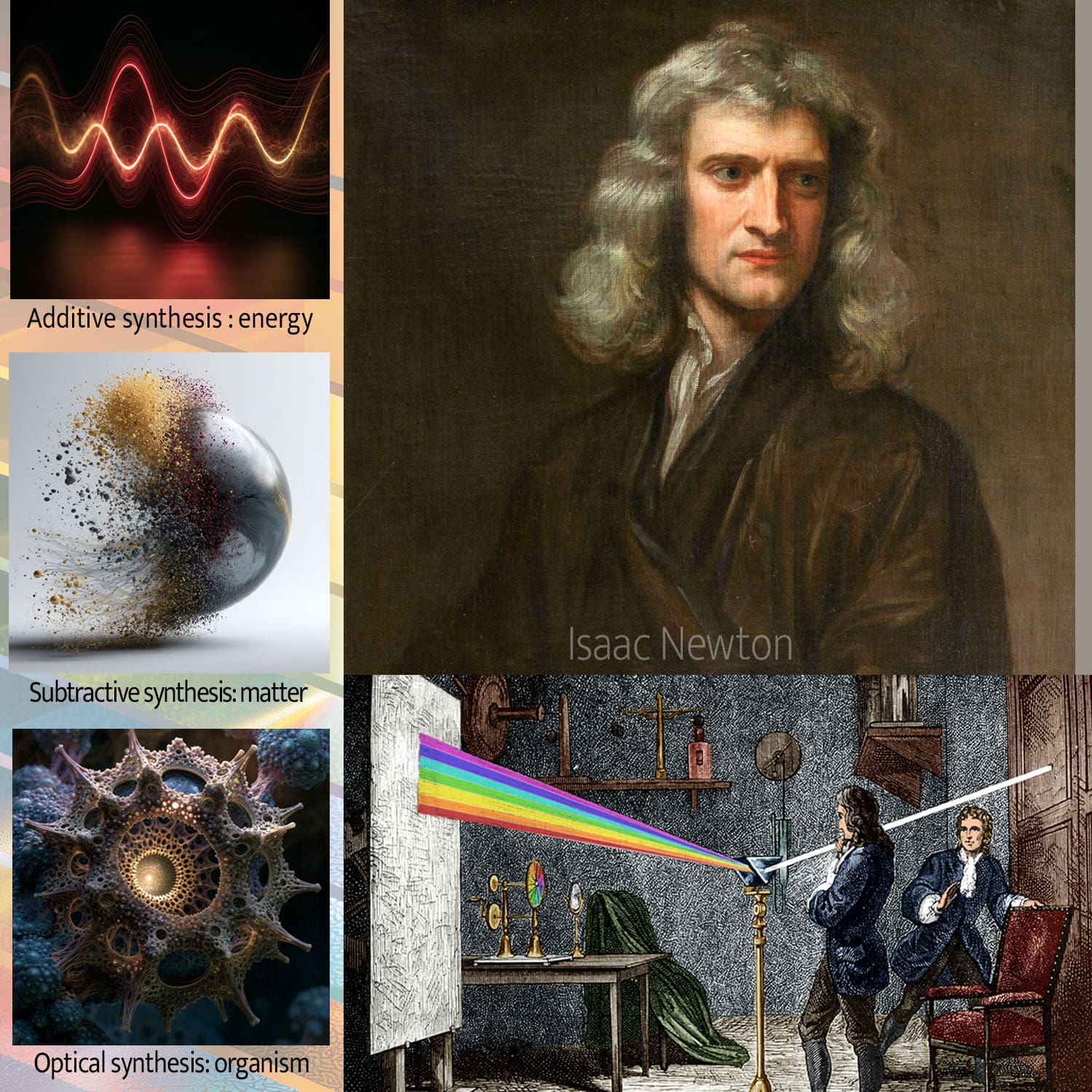
A sensation created at the level of the retina. Newton was the first to recreate white light through rotation by arranging seven colors on a disk.
The visual organ has an extraordinary faculty of differentiation because it surrounds a color with a simultaneous complementary halo which is reflected in any space located in the same visual field. This mechanism makes it possible to signal to the brain minute differences in lightness, hue and saturation. Several specialists will tell you there are 10 million shades.
Simultaneity and optical mixing are two opposing phenomena: the former highlights differences, while the latter cancels them out.
COLOR PERCEPTION
With color, we do not see what we see, because color—the most relative of artistic means of expression—presents an incalculable number of faces or appearances.
In visual perception, a color is never seen as it truly is; it is a means of artistic expression.
Effective use of color is possible only if you accept that color is constantly deceptive. Each individual perceives color through the lens of their own memories and emotions, interpreting it accordingly. Color is a personal fantasy that derives its richness from that very subjectivity; ask several people about their perception of red, for instance, and you will get a variety of different answers.
Colors appear in continuous flows within an environment in constant motion.
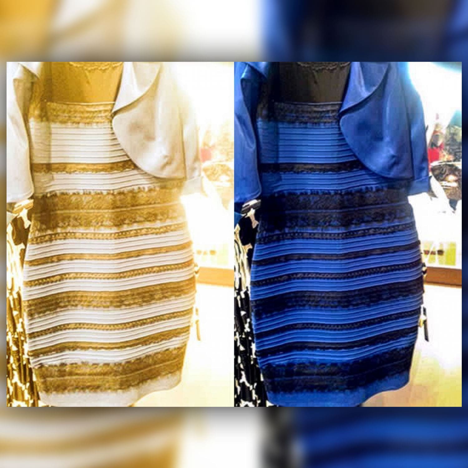
The phenomenon surrounding the color of this dress has offered us a lesson in humility and curiosity. The science behind this optical illusion of dress color is captivating: it all comes down to how our brain interprets the ambiguous lighting in the photo. It makes an assumption: natural or artificial light? And that single assumption changes everything. It’s a reminder that perception is personal.
Key Takeaways
- Color is a perception, not a universal truth: The dress phenomenon proved that our brains interpret color based on context and lighting. What you see is a personal interpretation, which is why finding the colors that consistently work for you is more important than following a trend.
- Lighting can make or break an outfit: The color you love in a store can look completely different in natural daylight or at home. This is because different light sources alter how we see hues, so it’s always a good idea to check a garment in various lighting conditions before committing.
- You can use color to your advantage: Color is a powerful styling tool for creating flattering visual effects. You can use darker shades to create a slimming line and place brighter colors on areas you want to highlight, allowing you to consciously shape your silhouette.
A COLOR WITH MANY FACES
Why? Because of their intensity, their luminosity.
SUBTRACTIVE COLOR

Let’s try three samples of three reds on a white background: You will certainly see red.

Three reds placed on another red: You will see a difference in tone or brightness.

Three reds on a background identical to one of the three reds: That one disappears.
COLOR DECEPTION
Colors are perceived differently from reality; they are an illusion.
The human retina is tuned via its nerve endings to receive the three primary colors— red, yellow, and blue—which produce the full spectrum of colors.
OPTICAL MIXING
In the color illusion known as “optical mixing,” the first color draws the other toward a different appearance. In this process, the two original colors are first cancelled out and rendered invisible, then replaced by a substitute known as “optical mixing.”
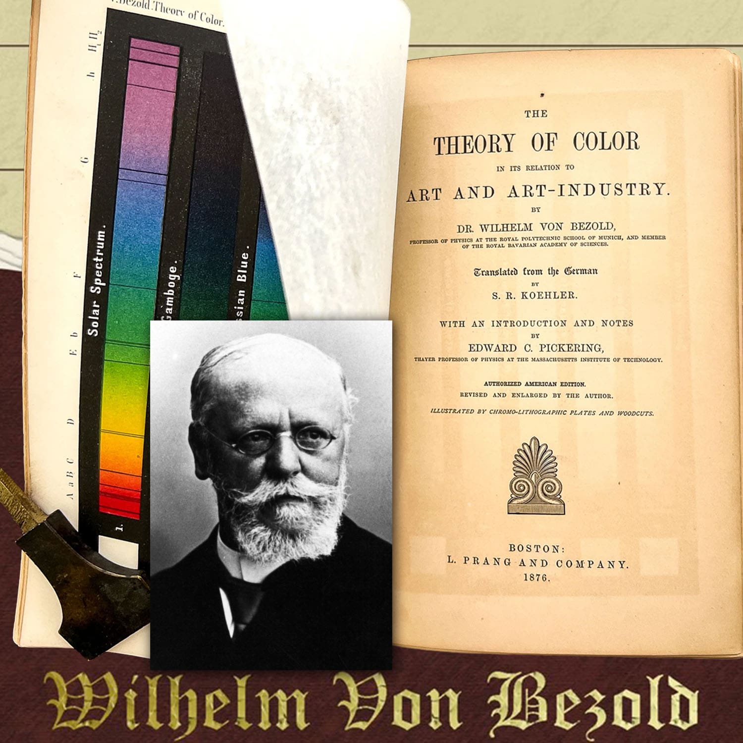
The inventor Wilhelm von Bezold (1837–1907) identified this effect while seeking a method to change color combinations in his carpet patterns by adding or modifying a single color.
“FILM” COLOR & “VOLUME” COLOR
Examples of “film” color used by many scientists studying light perception:

Distant mountains appear blue, even though they are covered in green trees or made of earth and rock.

The sun shines white during the day but turns red at sunset.
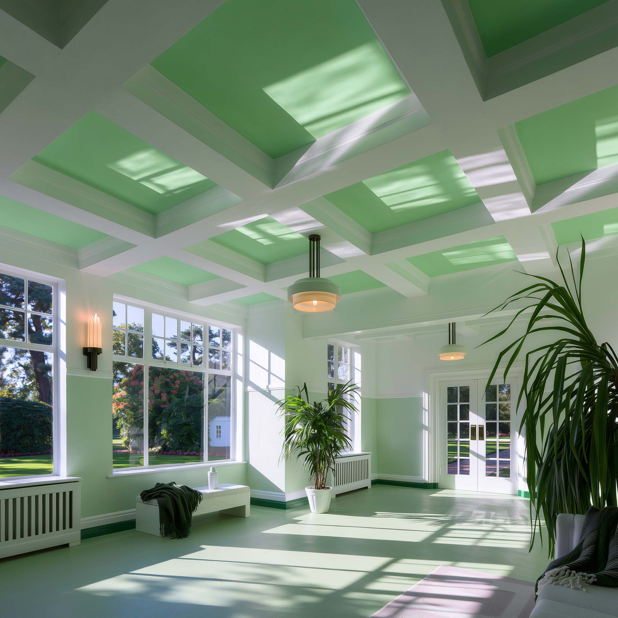
White ceilings in houses surrounded by lawns, or white-painted gutters, can appear brilliantly green in sunny weather.
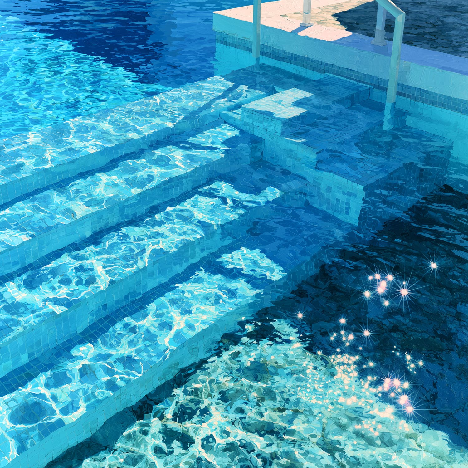
The “volume” color effect is striking when looking at a swimming pool with blue walls: the water seems tinted blue by reflection, and as you enter the pool via the steps, they appear increasingly blue.
All these examples illustrate that only transparent fluids exhibit “volume” colors.
RELATIVITY OF COLOR
A single color has multiple faces, and a color can be made to appear as two different colors.

No human eye is capable of seeing that two squares are identical.
COLOR PERCEPTION BY THE EYE
Color is a visual human perception based on the spectral distribution of light that stimulates the cones (nerve cells) located on the retina.
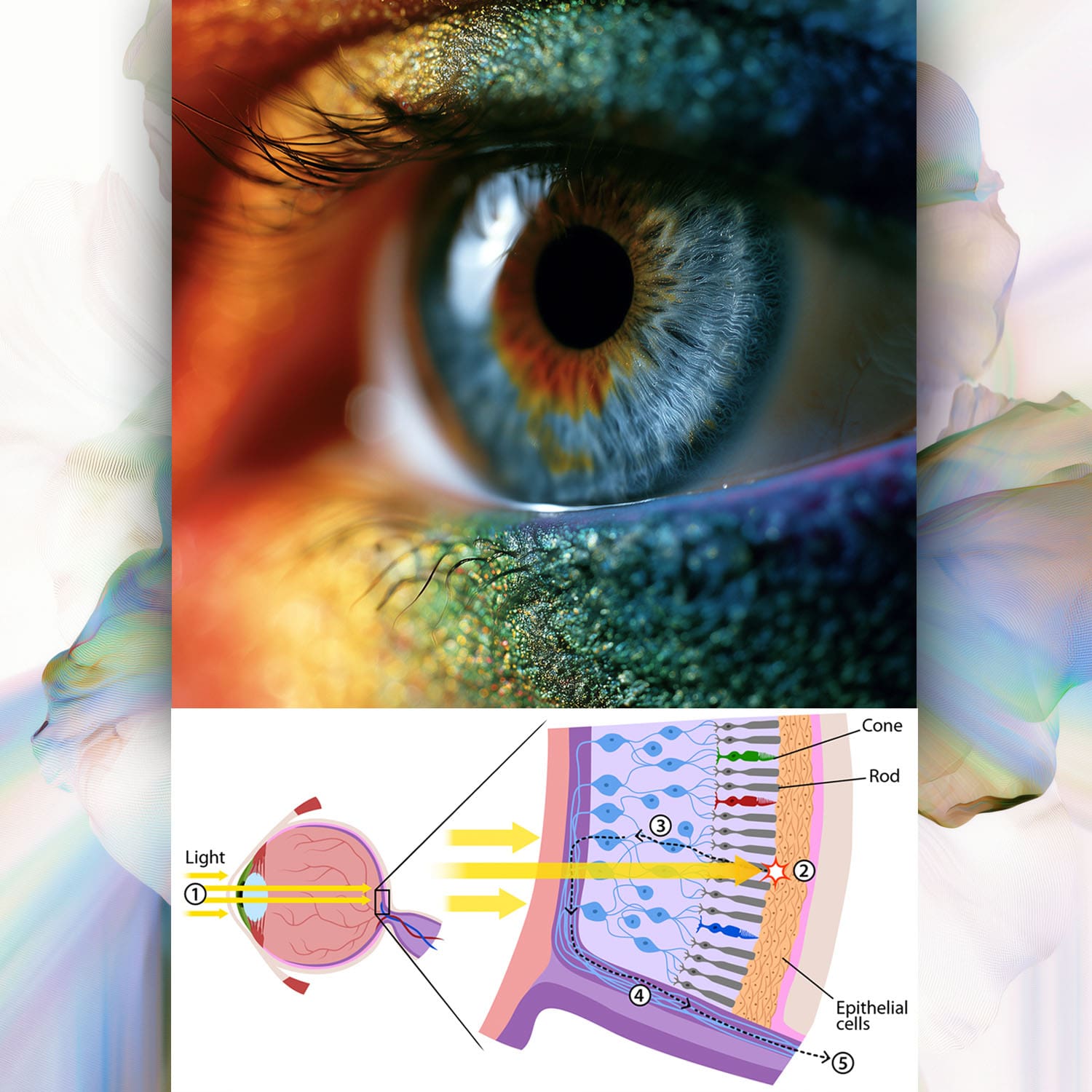
Color is a form of information involving artistic, chemical, physical, physiological, and philosophical dimensions; combined with your mental associations, it acquires symbolic meaning depending on the culture.
THE CONES
Cones are the true artists of your color vision.
They fall into three main types: S (sensitive to blue), M (sensitive to green), and L (sensitive to red). These tiny detectors capture different light wavelengths and transmit the information to your brain, which interprets it as a rich and varied color palette.
THE RODS
Although they are not directly involved in color perception, they are essential for seeing in low-light conditions. They work in tandem with the cones to ensure clear, sharp vision under all circumstances.
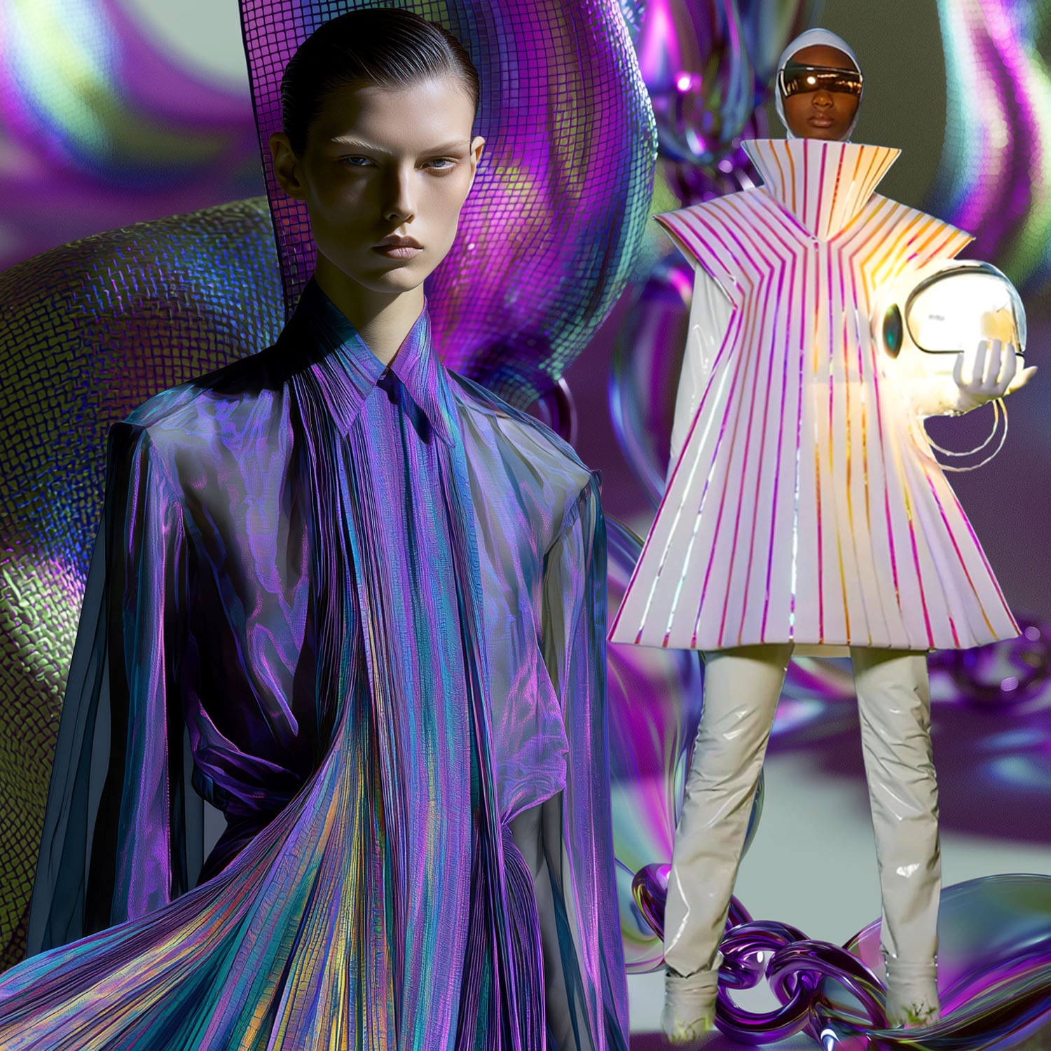
THE INTERACTION BETWEEN LIGHT AND COLOR
When light strikes an object, the object absorbs certain wavelengths and reflects others. It is these reflected waves that your cones capture. Once your cones have done their job, the optic nerve steps in to transmit electrical signals to your brain’s visual cortex.
The brain decodes these complex signals to create the colorful image you see.
FASHION
Since you have nailed down the technicalities of how the eye blends light and proximity, let’s look at how the runway actually exploits this phenomenon.
In fashion, optical color isn’t about the dye in the fabric; it’s about optical mixing, structural illusions, and movement.
The Pointillism of Textiles: Optical Weaving
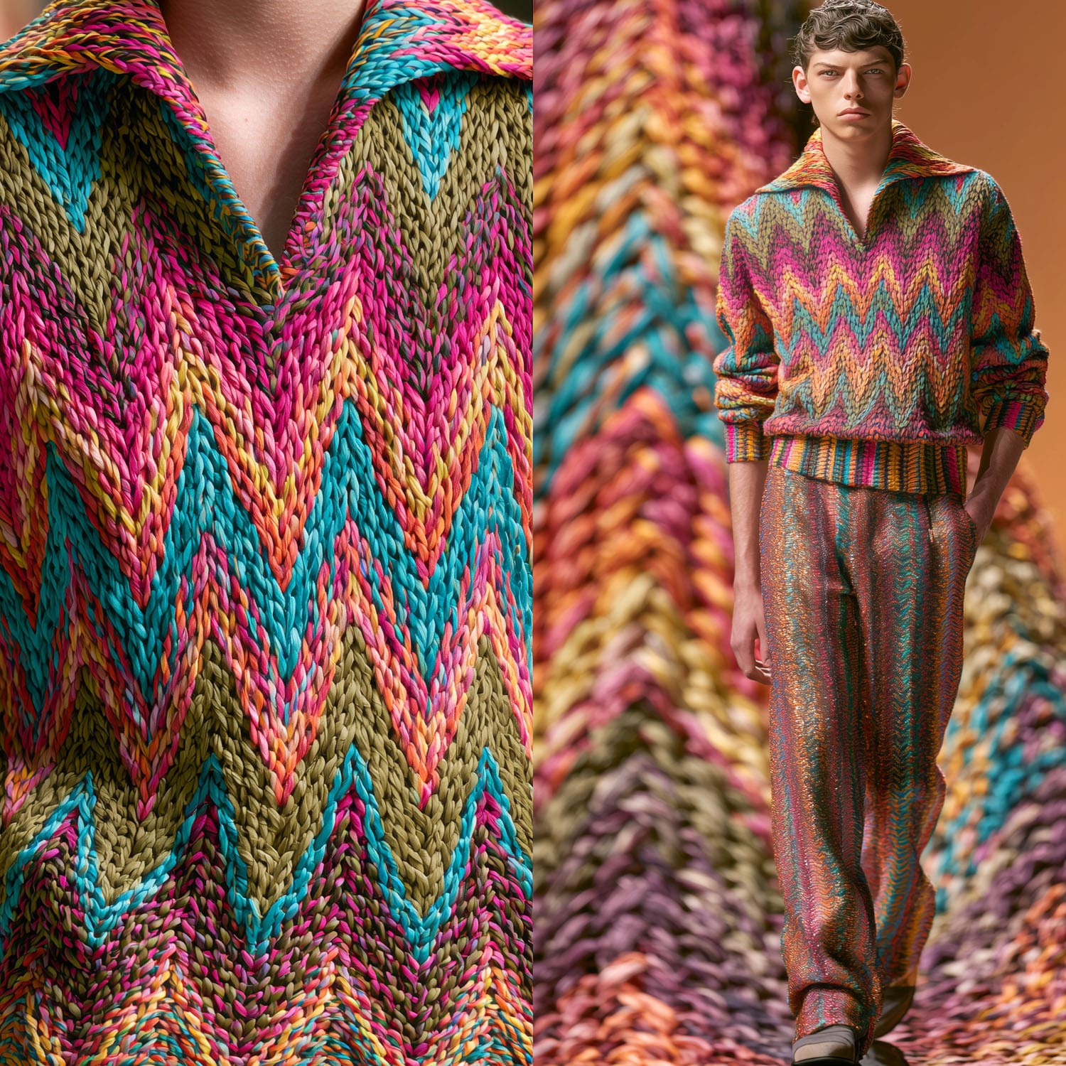
Instead of blending dyes in a vat, high-end textile designers blend individual colored yarns that trick the eye at a distance.
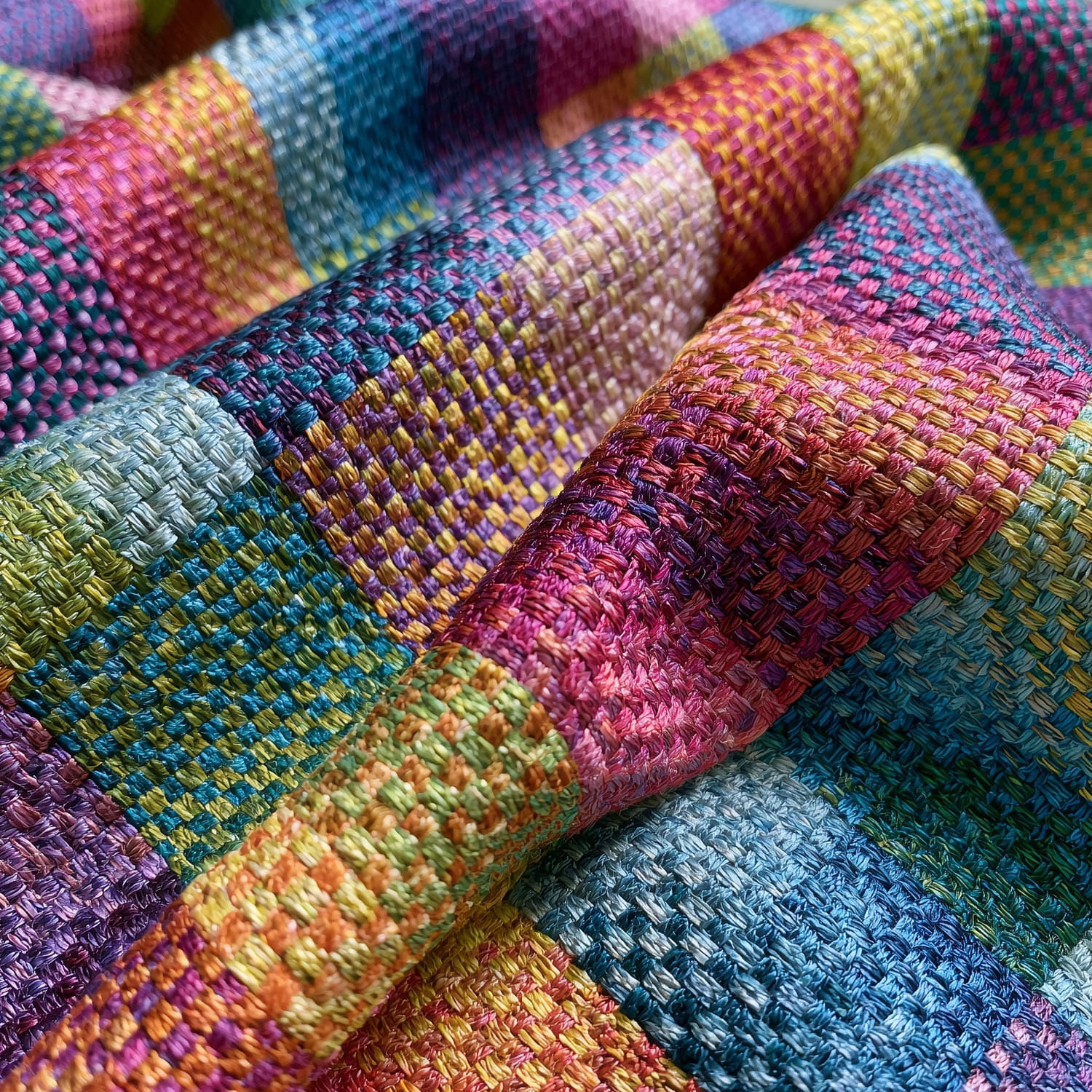
The Missoni Effect: Famous for its iconic zigzag knitwear. Up close, you see distinct, jarring threads of neon pink, turquoise, and olive green. Step three feet back, and the eye optically fuses them into a sophisticated, shimmering coral or muted bronze.
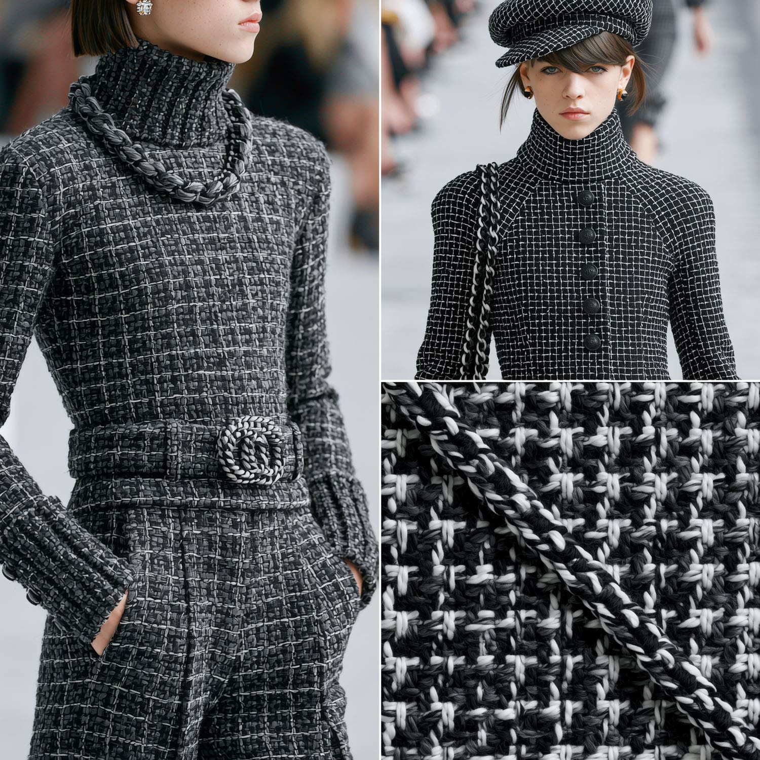
Classic Tweeds and Houndstooth: Chanel’s signature tweeds rely entirely on optical mixing. Black and white threads don’t touch, but they create the perfect luxury gray when walking down the runway.
Op Art and Spatial Manipulation
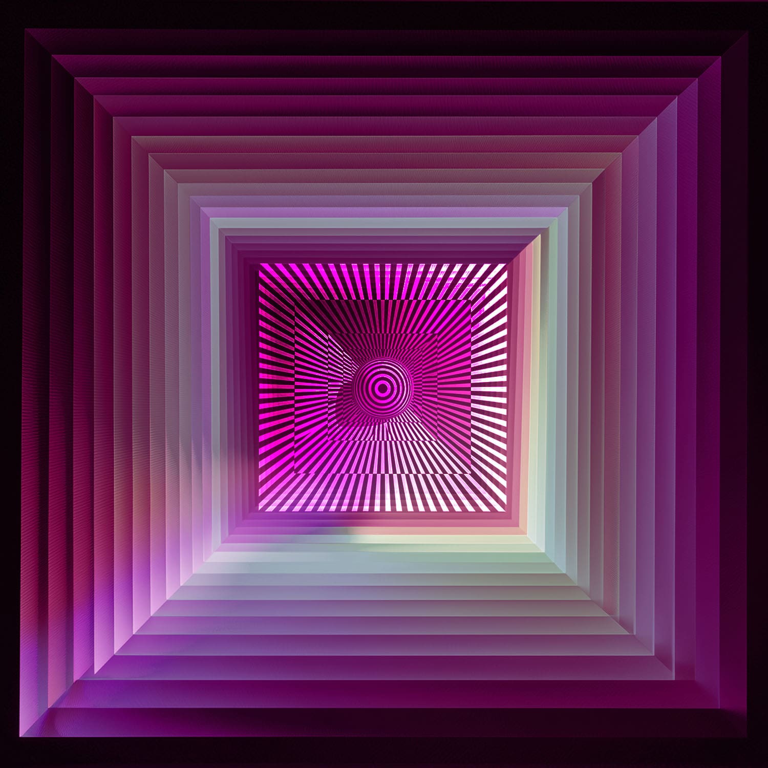
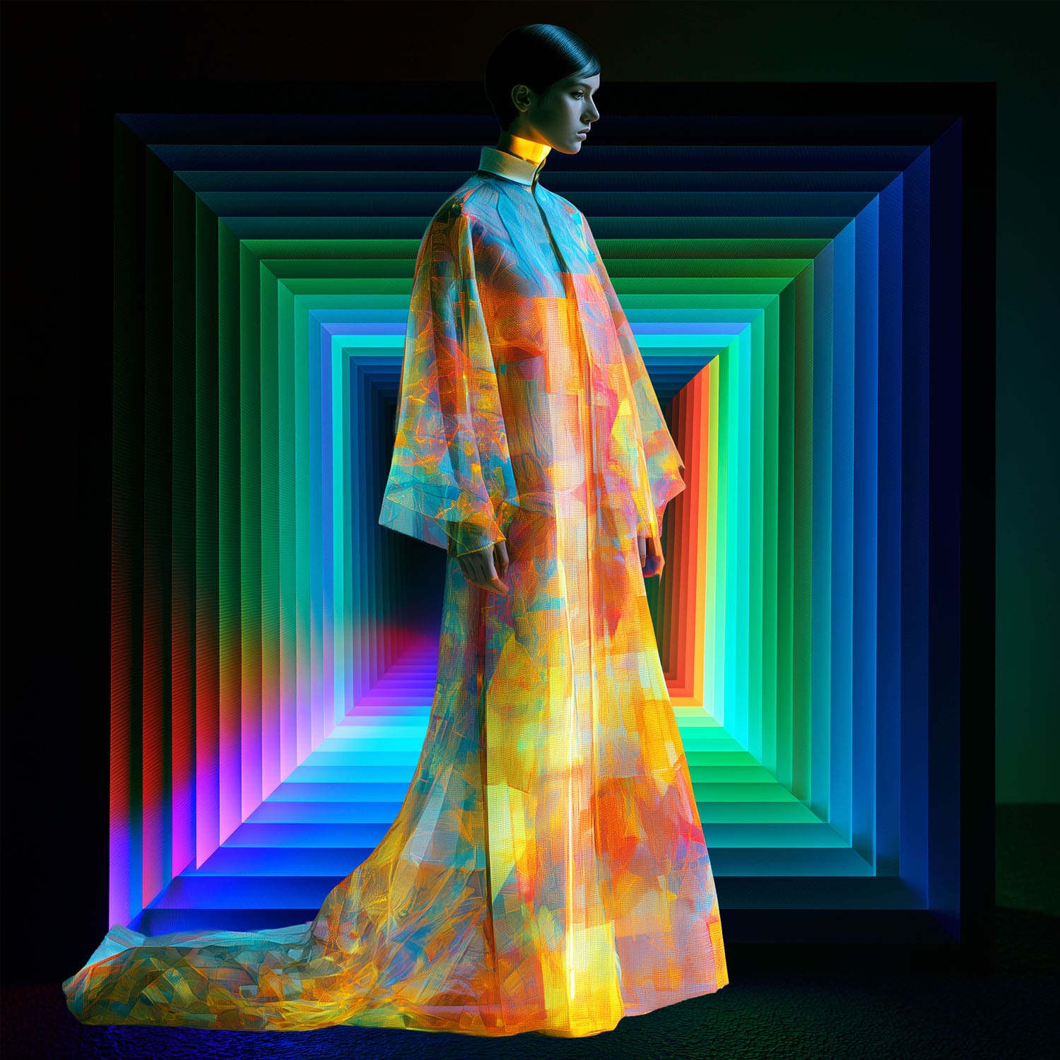
Designers use high-contrast geometric patterns to distort human proportions, creating illusions of volume or extreme leanness.
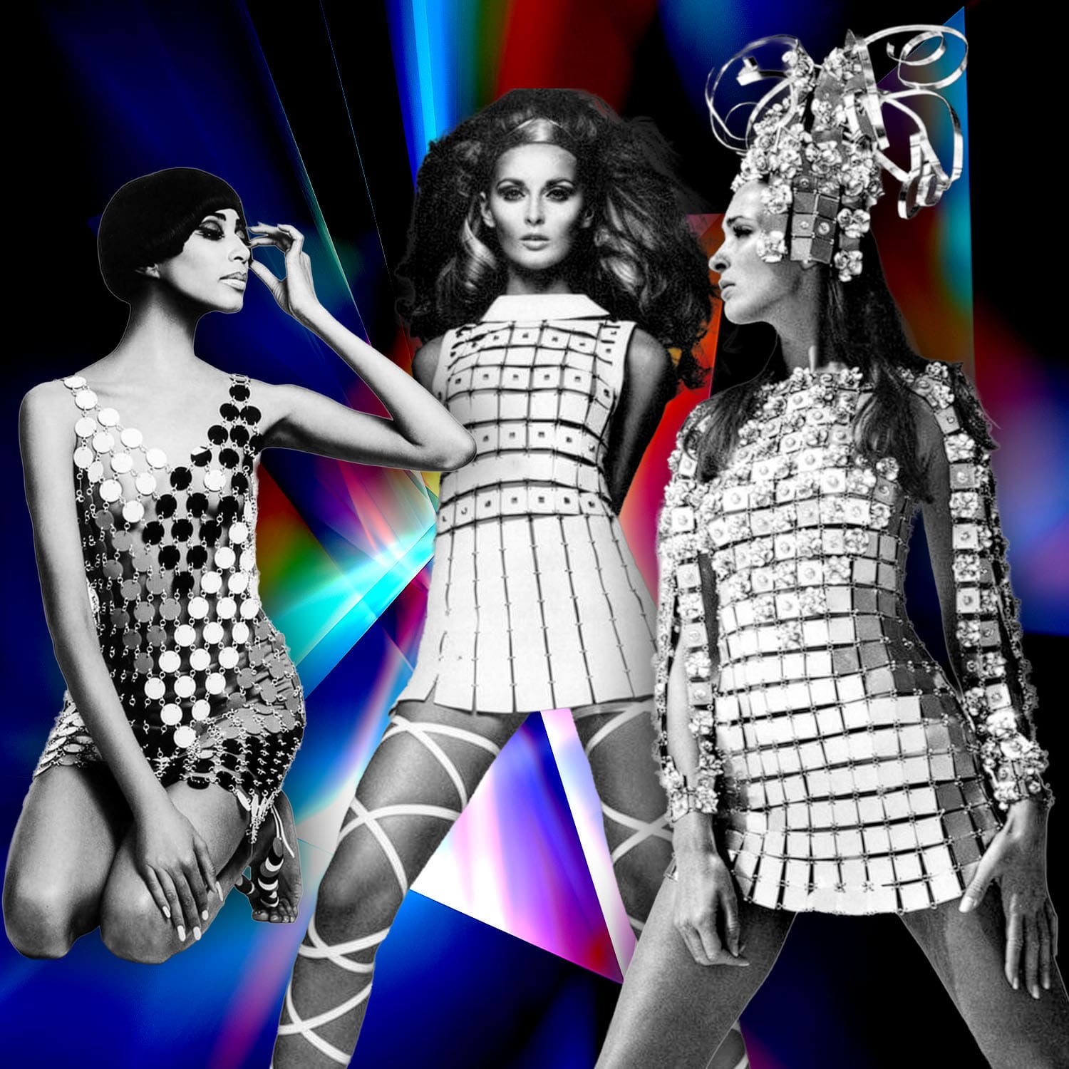
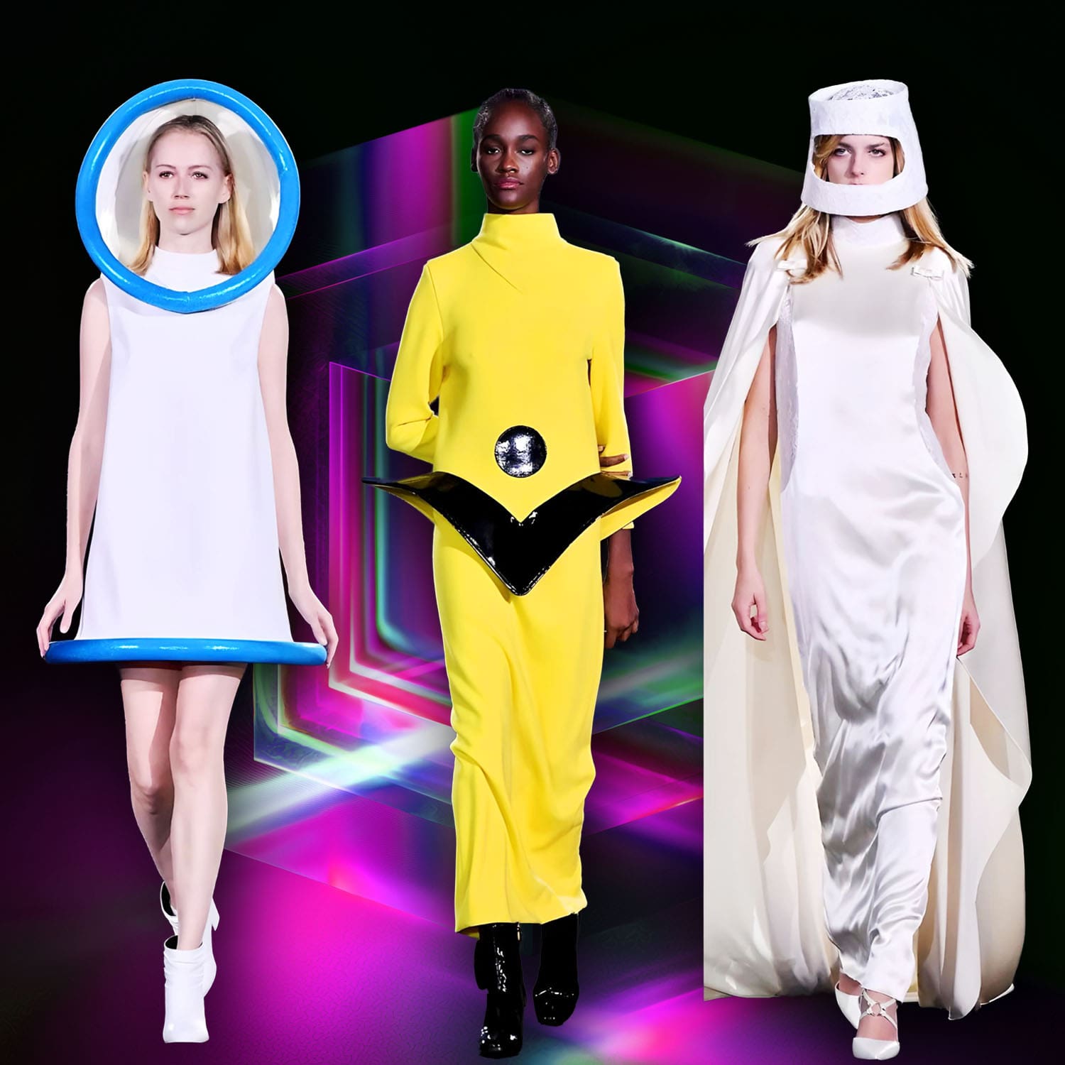
The “Hourglass” Delusion: Pierre Cardin and Paco Rabanne mastered this in the 1960s Space Age era. By strategically placing concentric circles or contrasting lines, they could visually alter the silhouette without changing the cut of the garment.
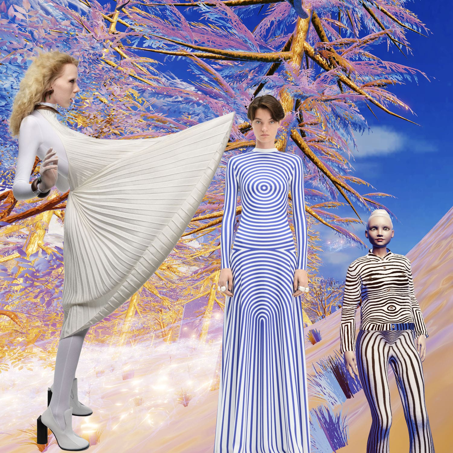
Modern Interpretation: Jean Paul Gaultier’s iconic “Body Morph” prints use optical color gradients to map out a hyper-contoured physique on flat mesh fabric.
Contemporary it is. On the modern runway, optical color is less about fixed prints and entirely about kinetic manipulation—how a garment translates from a static front-row glance into a shifting, liquid gradient under show production lighting.
Here is a draft focusing on the intersection of texture, technology, and movement:
The Contemporary Runway: Kinetic Color and Light Manipulation
In contemporary haute couture, optical color has evolved from a static graphic technique into a dynamic performance. Designers no longer rely solely on the eye to mix static threads; instead, they manipulate fabric structures, high-tech coatings, and specific runway show lighting to create colors that exist only in motion.
The Moiré Effect and Kinetic Pleating
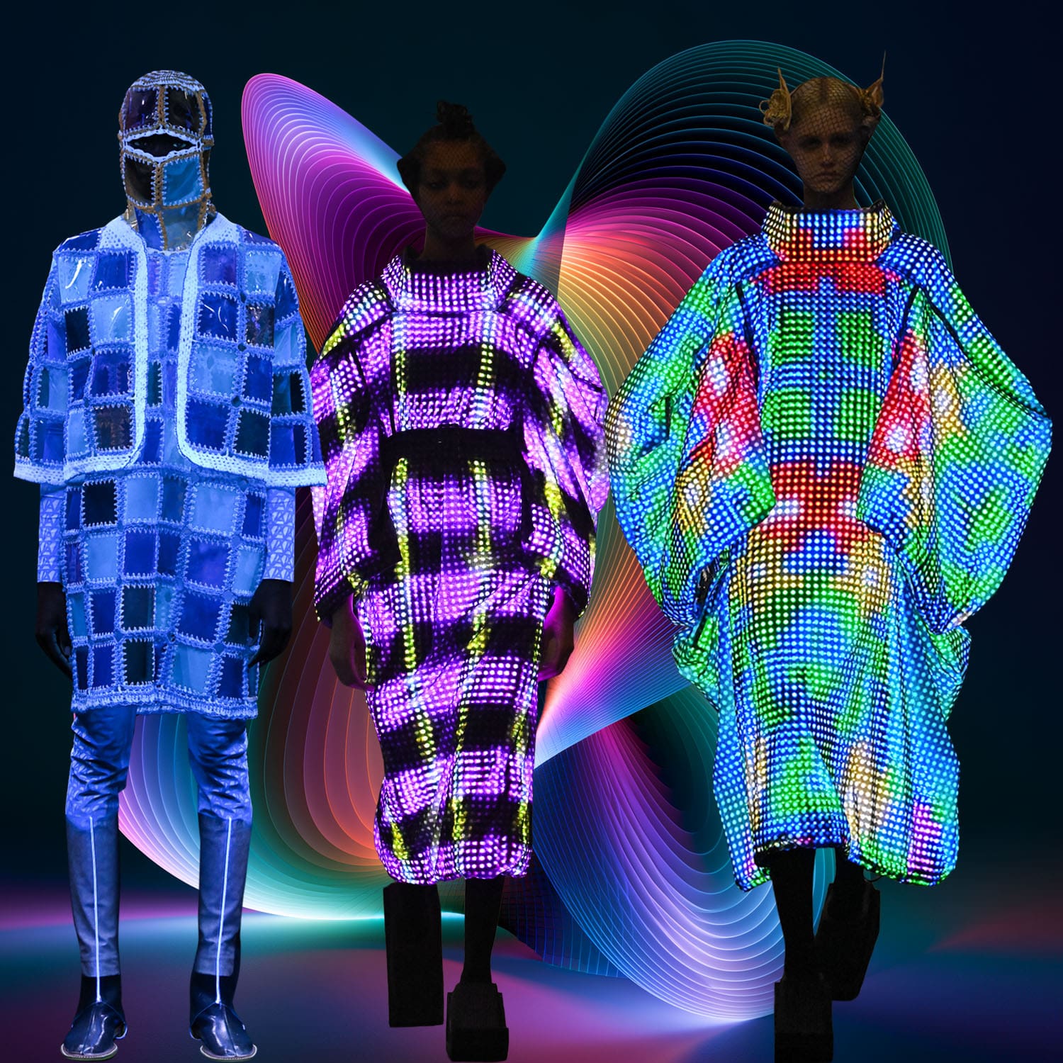
Modern maisons use structural manipulation to create shifting color gradients without changing the base pigment. By layering ultra-thin, contrasting transparent fabrics or employing precise pleating, the garment generates a moiré pattern as the model walks. The lines of the fabric interfere with one another, tricking the human eye into perceiving undulating waves of shadow and intense color that instantly vanish when the model stops moving.
Photonic Textiles and Light Refraction
The cutting edge of luxury fashion borrows directly from nature’s physics—specifically, how a beetle’s shell or a butterfly’s wing creates color purely through structural geometry. Designers use materials coated with microscopic prisms or lenticular polymers. Under standard showroom lighting, the garment might appear as a muted gray or deep indigo; however, the moment the heavy, directional stage lights of the runway hit the moving fabric, the light fractures. The result is a fluid, iridescent shift—turning the runway into a canvas of unstable, shimmering hues that depend entirely on the angle of the editor’s seat.
If we step away from Iris van Herpen’s structural pleating, the absolute master of contemporary optical color manipulation is Kunihiko Morinaga of the Japanese maison Anrealage.
Instead of manipulating the shape of the garment to change how light hits it, Morinaga chemically alters the fabric’s response to the environment using photochromic technology.\
Here is an alternative draft focusing on this intersection of chemical technology and runway performance.
The Contemporary Runway: Environmental Shifts and Photochromic Evolution
In contemporary fashion, optical color is no longer bound to a fixed pigment or passive thread placement. Modern designers are treating fabric as a dynamic, responsive surface that changes color based on environmental triggers, shifting our entire understanding of human perception.
Photochromic Evolution: Fabric as a Reactive Canvas
The most radical shift in contemporary optical color is the use of photochromic textiles—materials embedded with molecules that alter their chemical structure when exposed to specific light wavelengths.
During his breakthrough Paris collections, designer Kunihiko Morinaga of Anrealage sent models down the runway clad entirely in stark, minimalist white garments made from lace, knitwear, and satin. Two industrial ultraviolet light strips then descended from the ceiling, slowly scanning the models’ bodies. As the UV light tracked across the fabric, it triggered an instantaneous optical transformation. The pure white vanished, replaced by vibrant yellow, deep purple, and intricate multicolored monogram patterns. Once the models stepped away from the light source, the colors slowly faded back into white.
The Illusion of Dual Existence
This technique shifts optical color from a gimmick into a philosophical study of visibility. By controlling the light environment, the designer forces the viewer to realize that a single garment possesses two simultaneous identities: one hidden in the dark and one revealed by light.
More recently, this has evolved into garments featuring programmable LED surfaces and advanced projection alignment. As a model moves through a space, the clothing renders visual patterns that perfectly synchronize with the room’s environment, creating a camouflage effect where parts of the garment appear to dissolve entirely into the background. The optical color isn’t woven into the garment; it is actively broadcast by it.
Here are visual references illustrating how these houses use structural texture, geometry, and placement to create optical color effects.
Key Details to Observe:
• Jean Paul Gaultier: Notice how the dark contour lines map across the fabric. It uses fine lines to trick the viewer’s depth perception, simulating physical dimensions on a completely flat material.
• Missoni: Up close, the high-contrast pinks, blues, and deep burgundies are distinct stripes. From a distance, the eye blends these sharp steps into softer, more unified tertiary shades.
• Chanel Tweed: Look at the varied weights and shades of blue, white, and silver threads. They aren’t dyed together; the optical gray-blue tone is created purely by the tight, multi-layered weave.
• Paco Rabanne & Pierre Cardin: The 1960s mastery of hard surfaces. Rabanne’s metal links break up light into thousands of tiny reflections, while Cardin uses high-contrast blocking to alter natural body proportions.
Conclusion: The Living Canvas
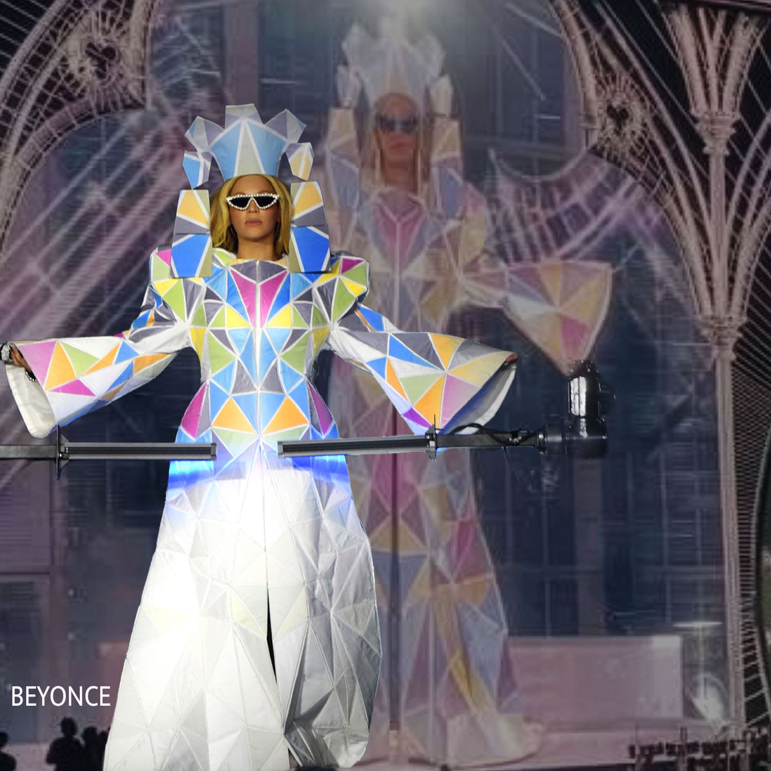
Ultimately, optical color in fashion proves that clothing is never a static object, but a dynamic dialogue between the garment, the light, and the human eye. By shifting the focus from pigment to perception, designers transform the runway into a living canvas where color is not merely applied, but actively created in the space between the thread and the viewer.
From the meticulous weavers at Chanel and Missoni who trust the eye to blend separate threads into a unified luxury hue, to the spatial geometry of Cardin and the modern, light-reactive tech of Anrealage, fashion continuously exploits the loopholes of human vision.
It turns a physical silhouette into a shifting illusion, demanding that we look closer. In a world increasingly saturated by flat digital screens, optical fashion offers a rare, sensory reminder of the beauty of physical movement—proving that the most spectacular colors are often the ones our own minds create.
Guillaumette Duplaix
